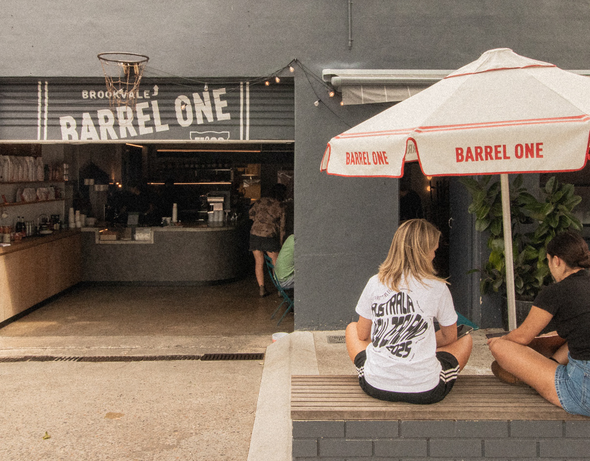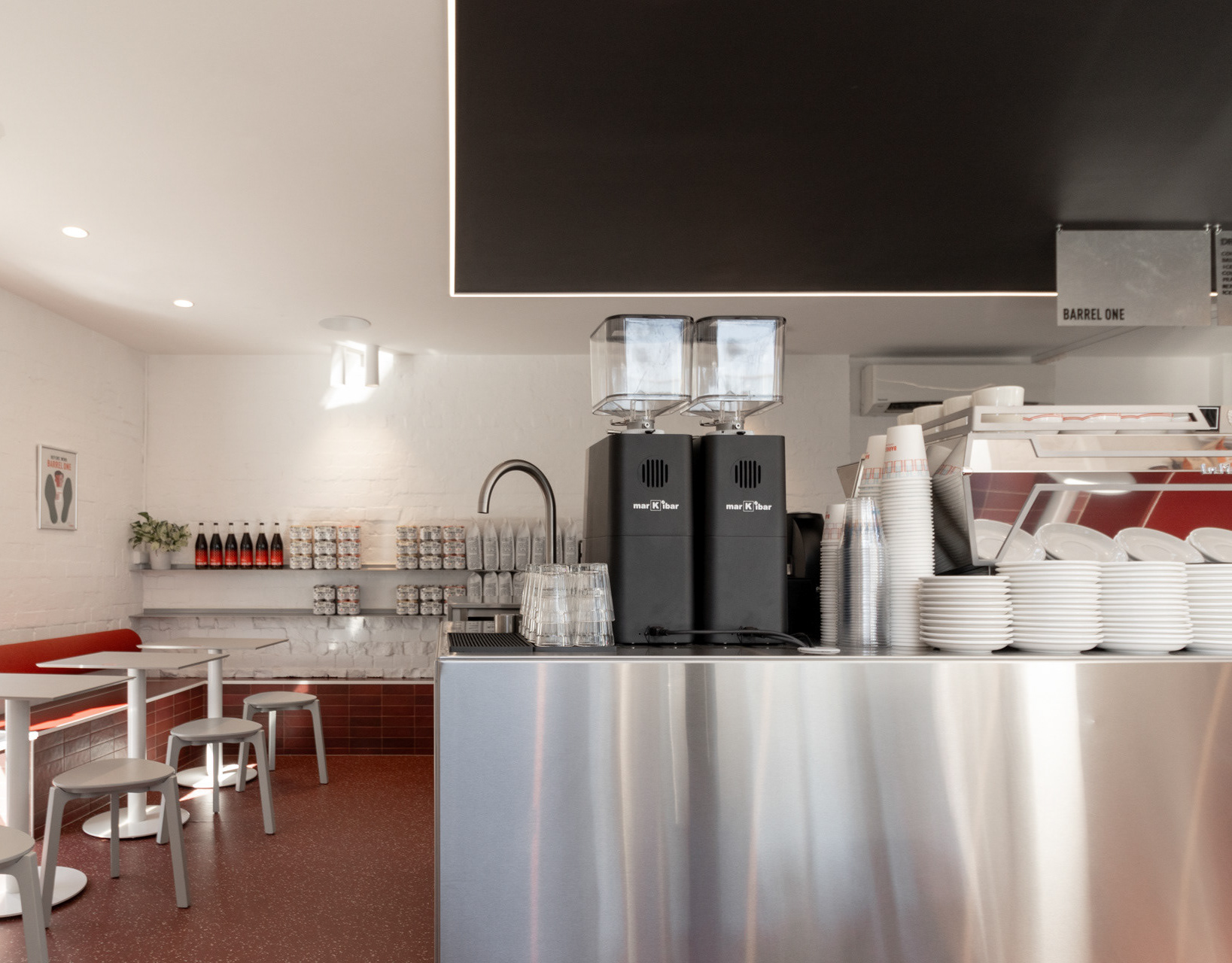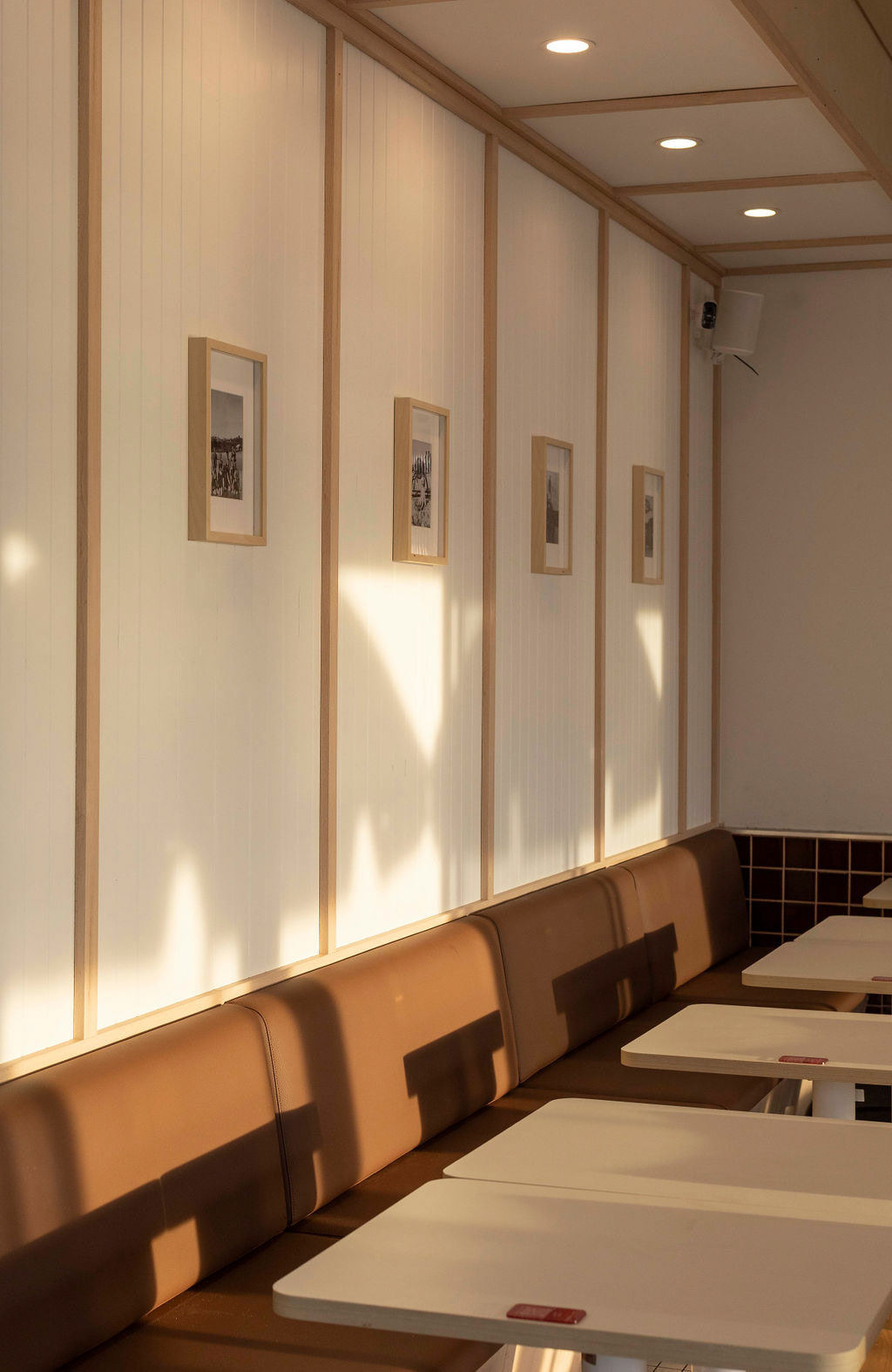
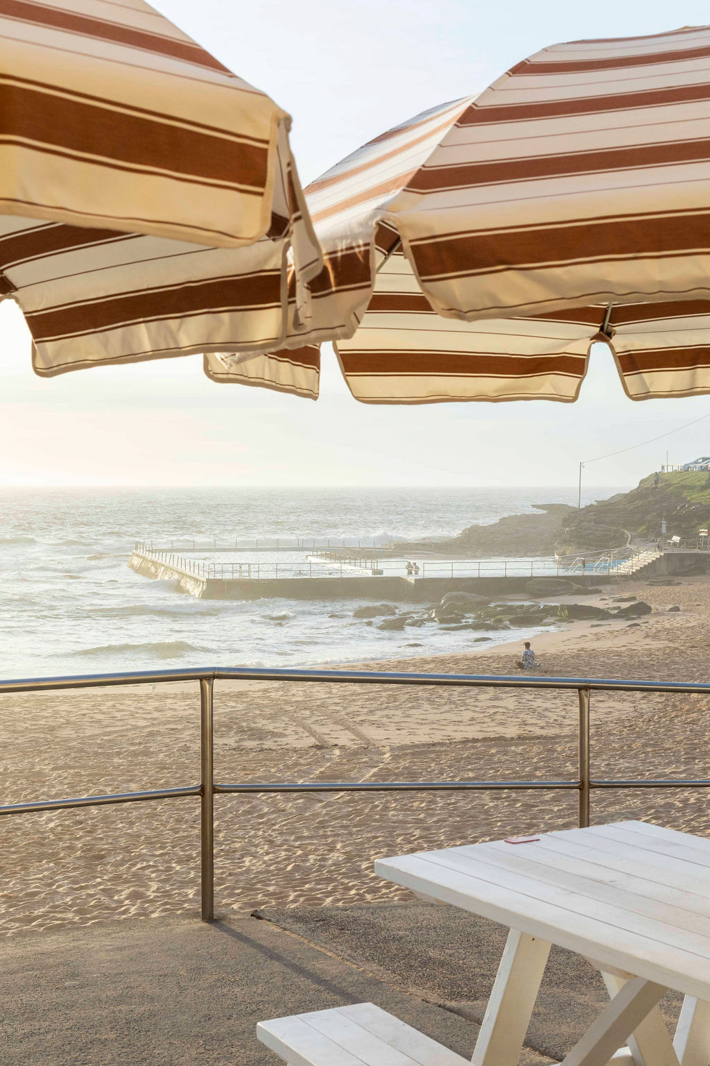
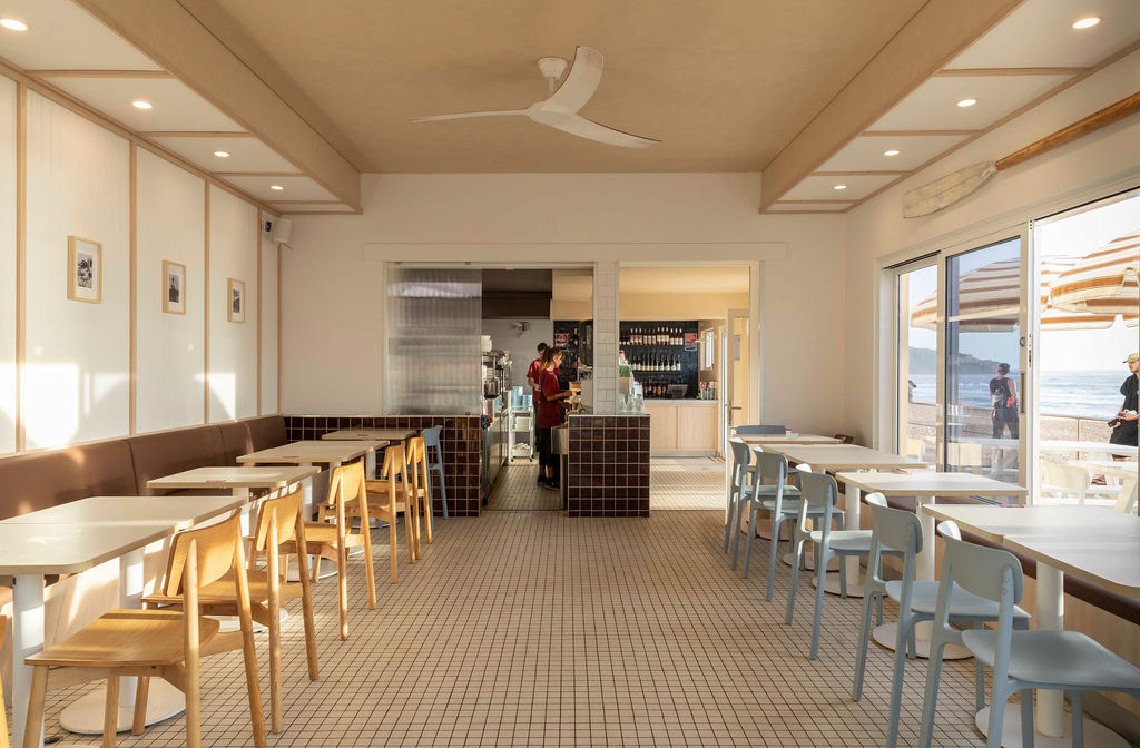
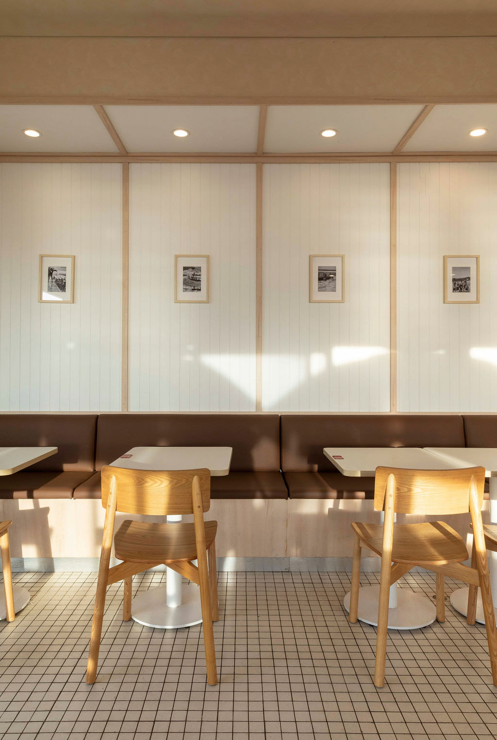

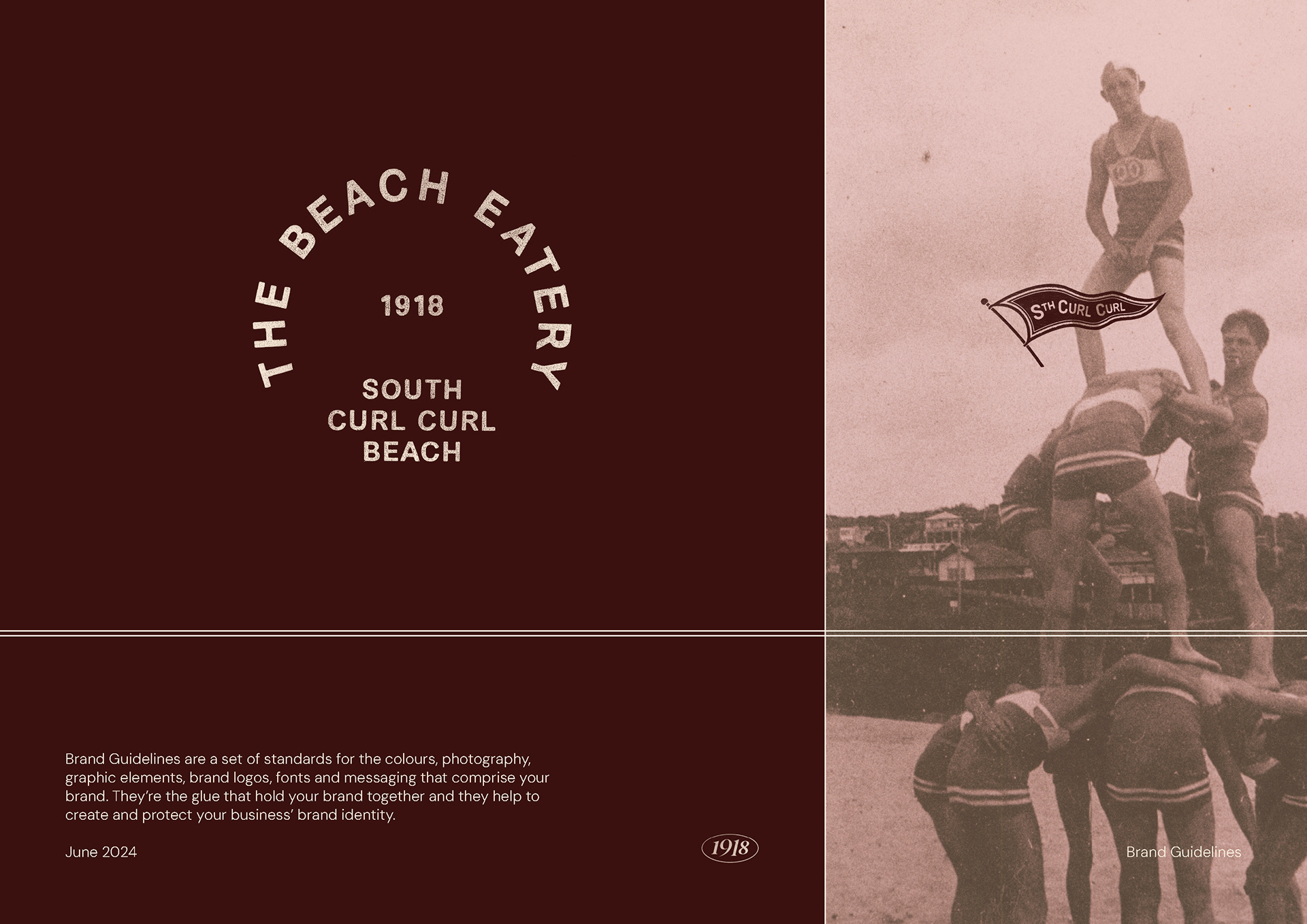
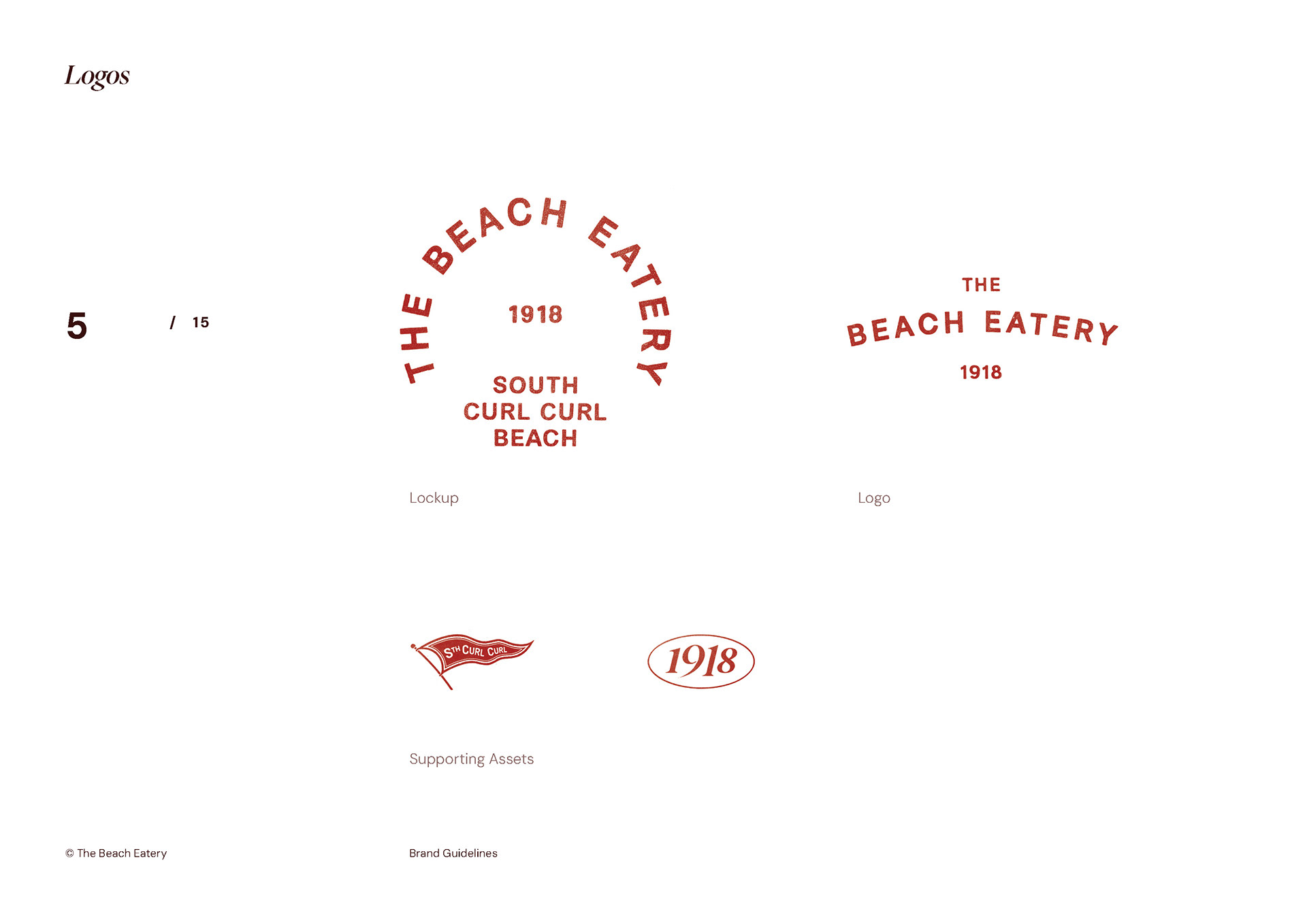
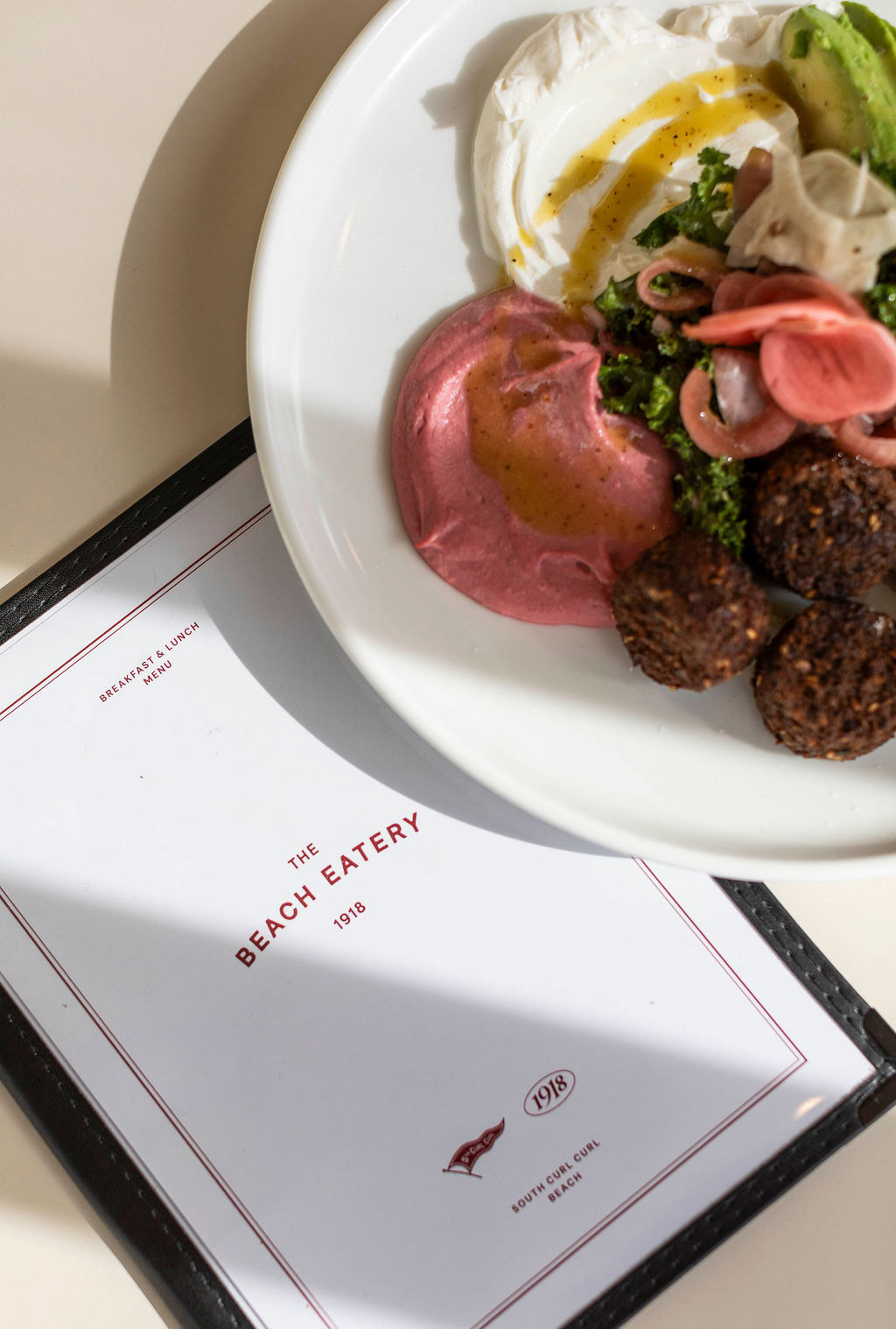
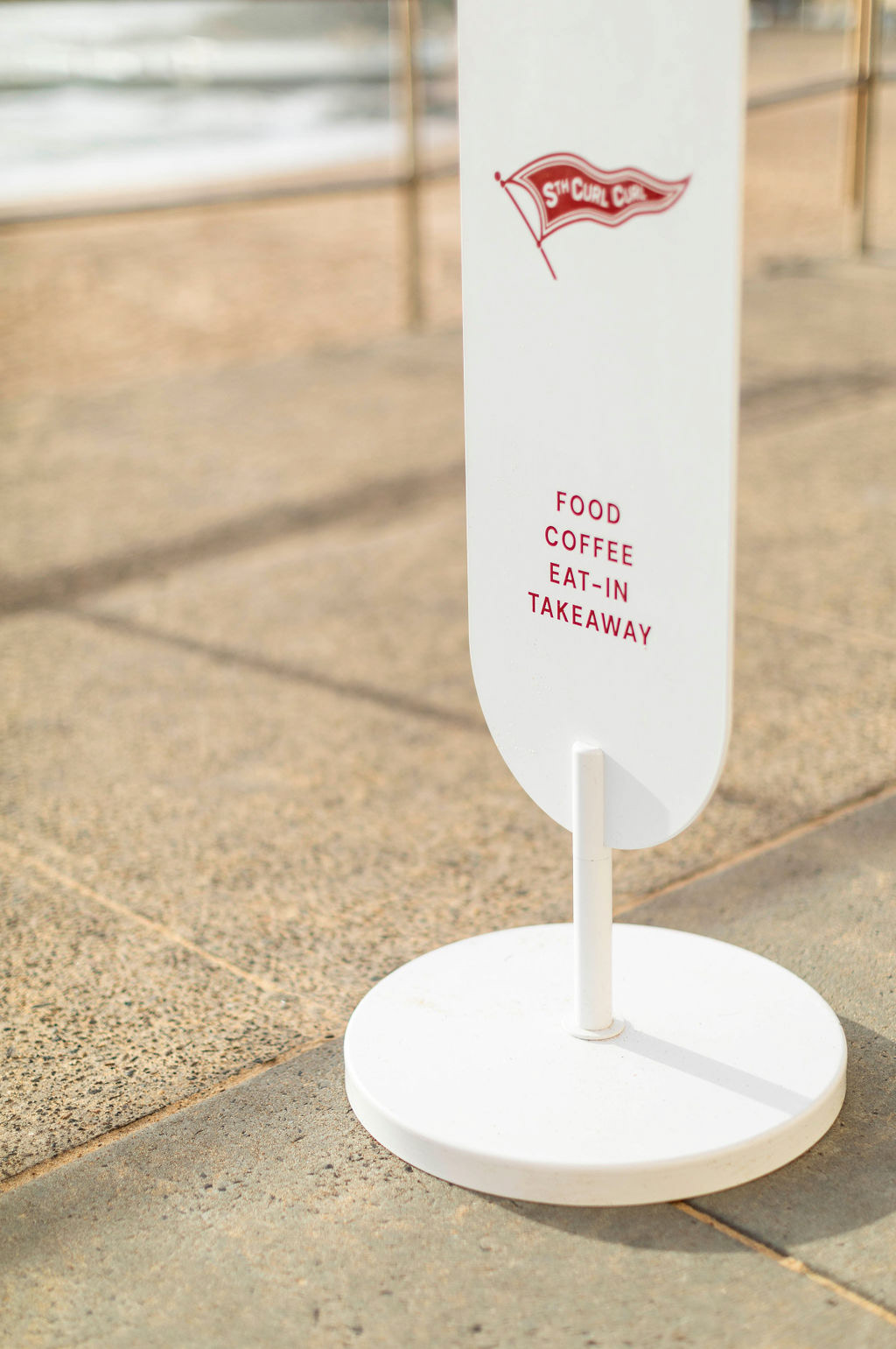
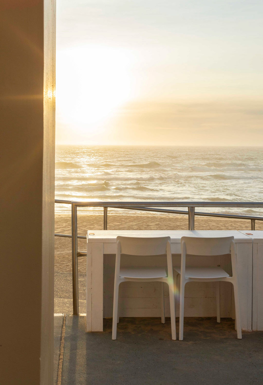
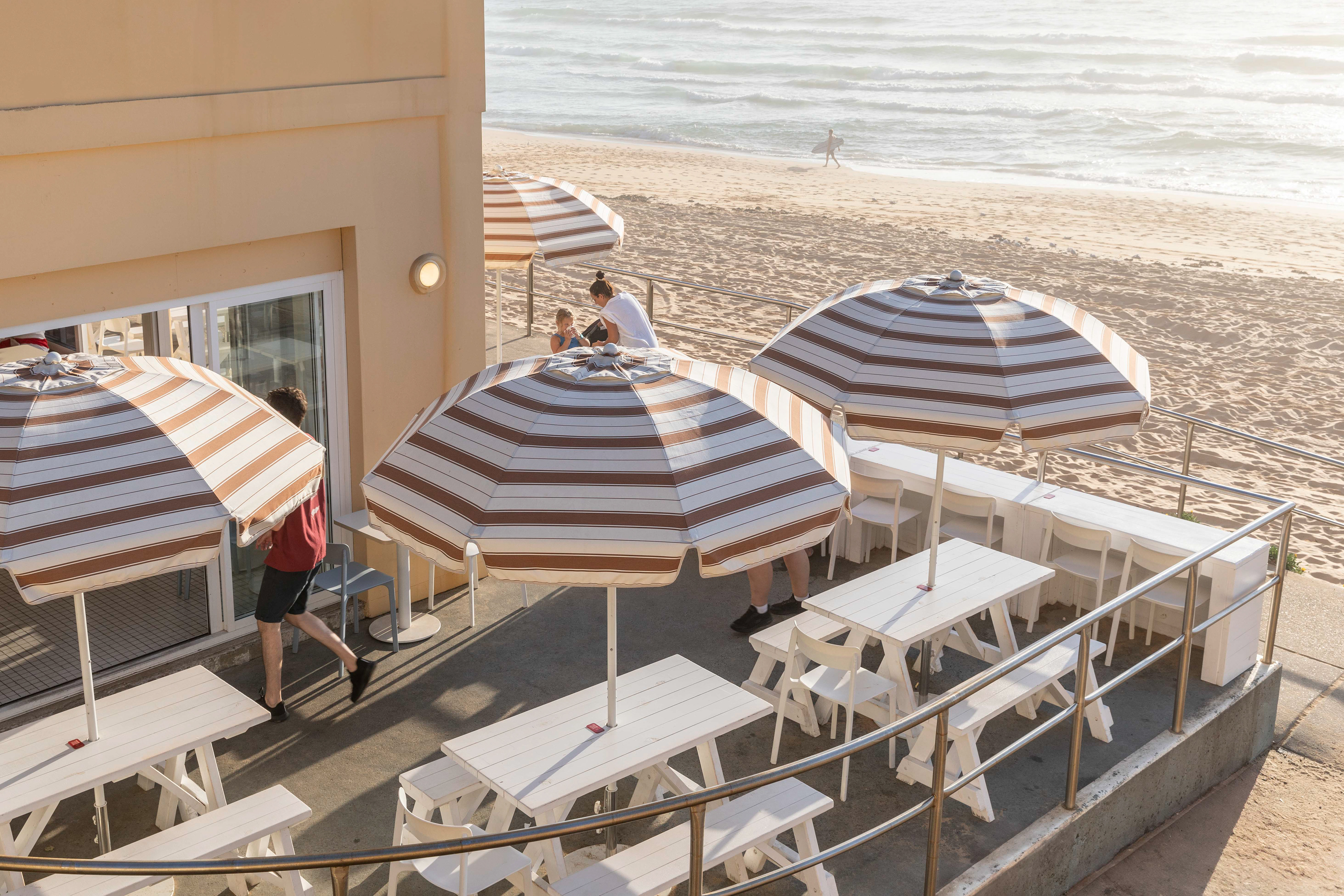
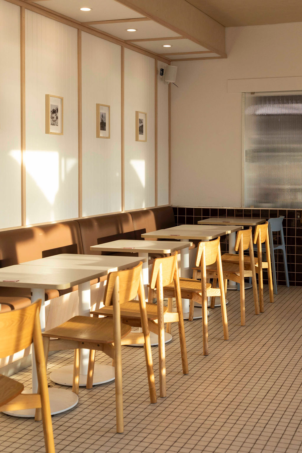
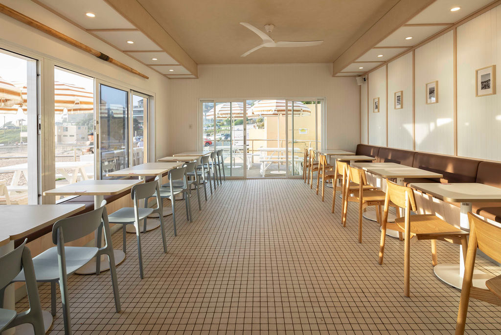

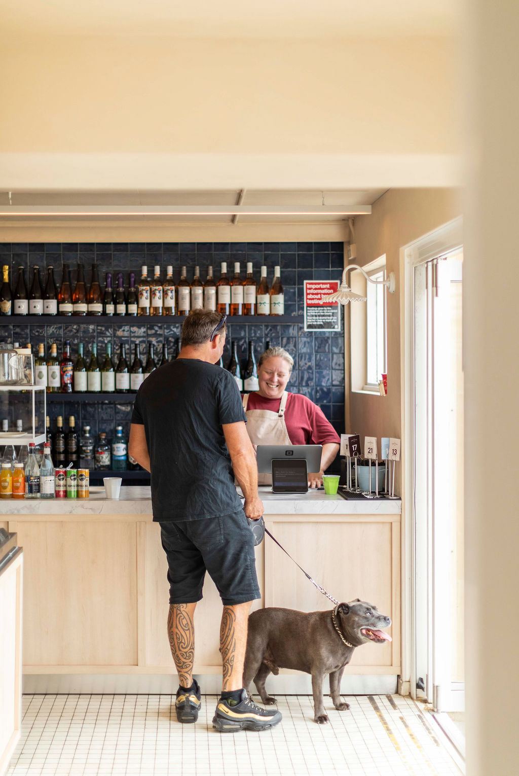
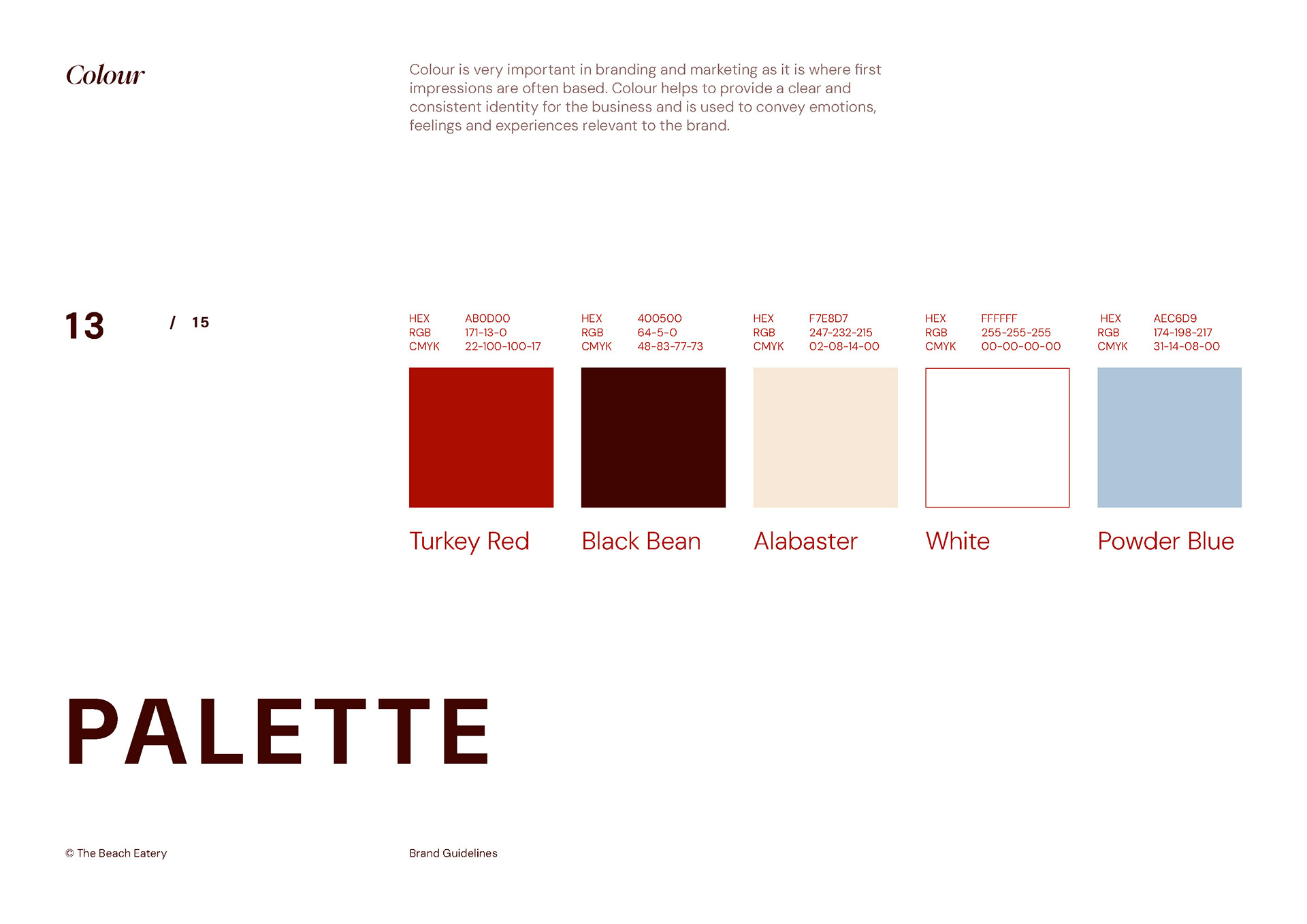
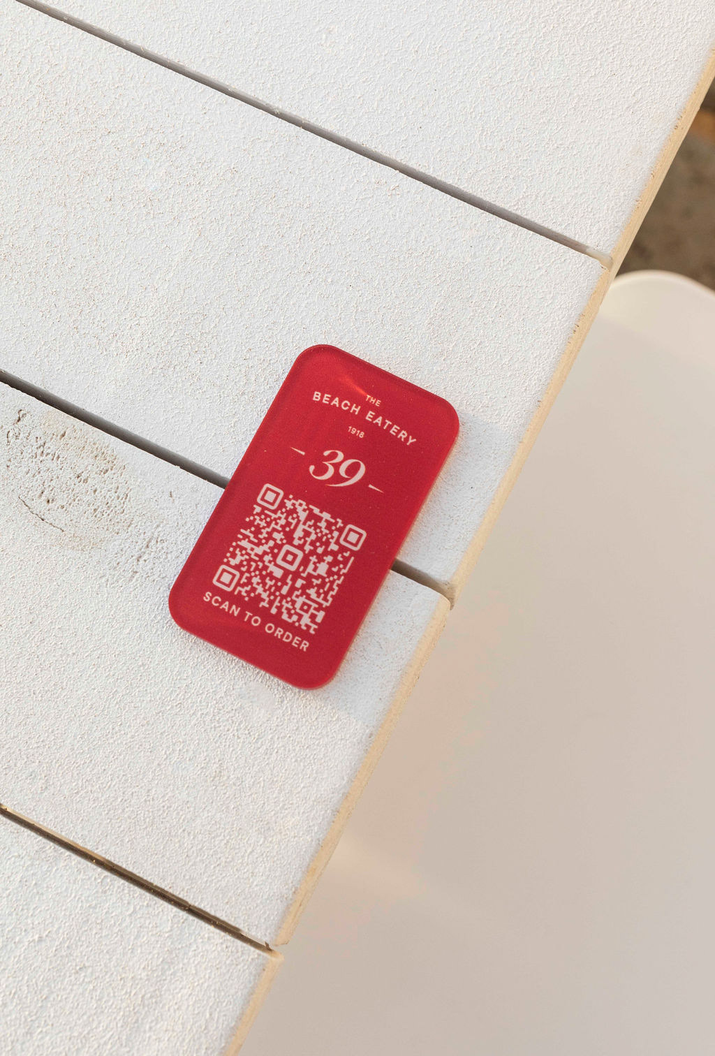


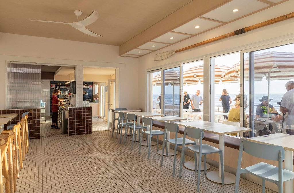
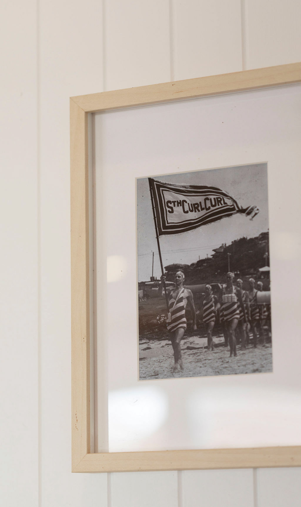
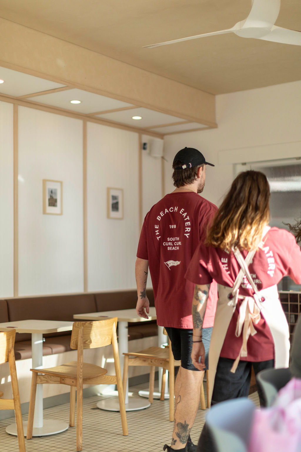
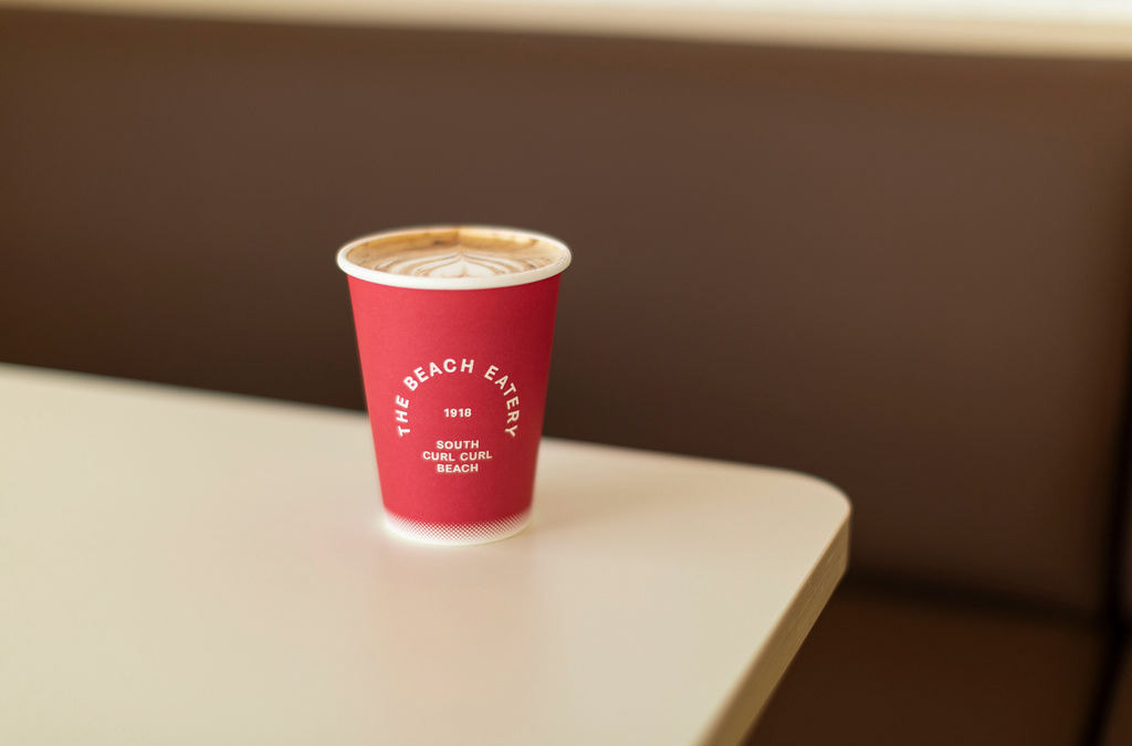

Occupying a site with a rich history dating back to 1918, the brief for The Beach Eatery was to create a space that felt deeply rooted in the local social fabric while providing a refined, modern coastal experience. The design response is a study in "70s coastal nostalgia", a curated dialogue between heritage graphics and contemporary materiality. The brand identity celebrates its SLSC origins through a series of "supporting assets," including a hand-drawn pennant and a textured, circular lockup that evokes vintage club insignia. The palette - Turkey Red, Black Bean, Alabaster, and Powder Blue - was selected to feel both patriotic and weathered by the sun, bridging the gap between historical pride and an approachable, community-focused mood. Spatially, the fitout utilizes a clean, rhythmic material language designed to frame the horizon. Light oak furniture and white-paneled walls provide a neutral, airy envelope that amplifies the natural light. This softness is punctuated by high-gloss, deep cobalt tiling behind the bar, a tactile nod to the ocean, and a strict grid-tiled floor that provides a structured, retro-modern foundation. By integrating 70s-inspired wayfinding and striped Basil Bangs umbrellas with a disciplined architectural grain, The Beach Eatery functions as a seamless extension of the beach itself. It is a space designed for longevity, celebrating the values of loyalty and community through a curated sensory lens. Photos by Liz Keene - lizkeene.com