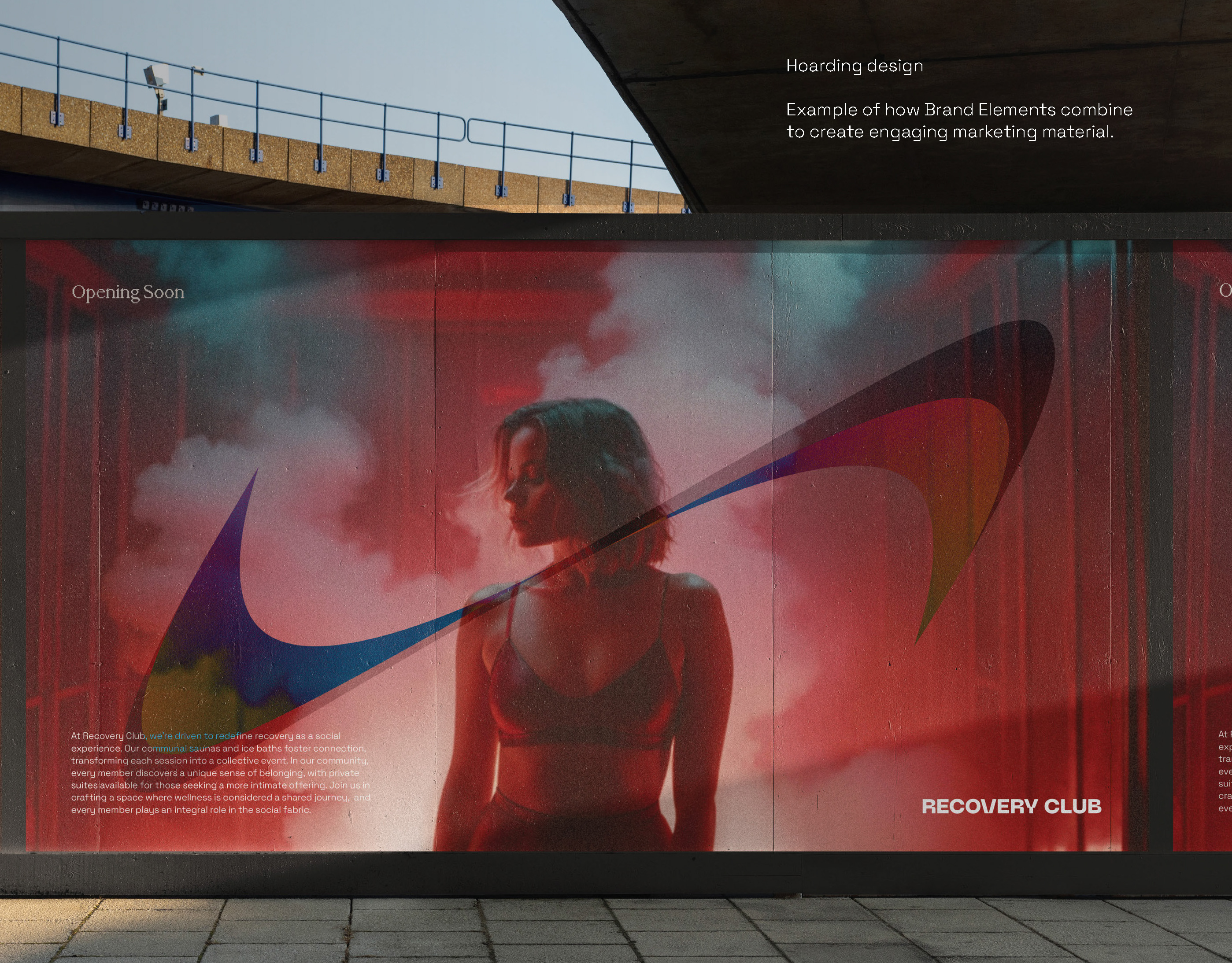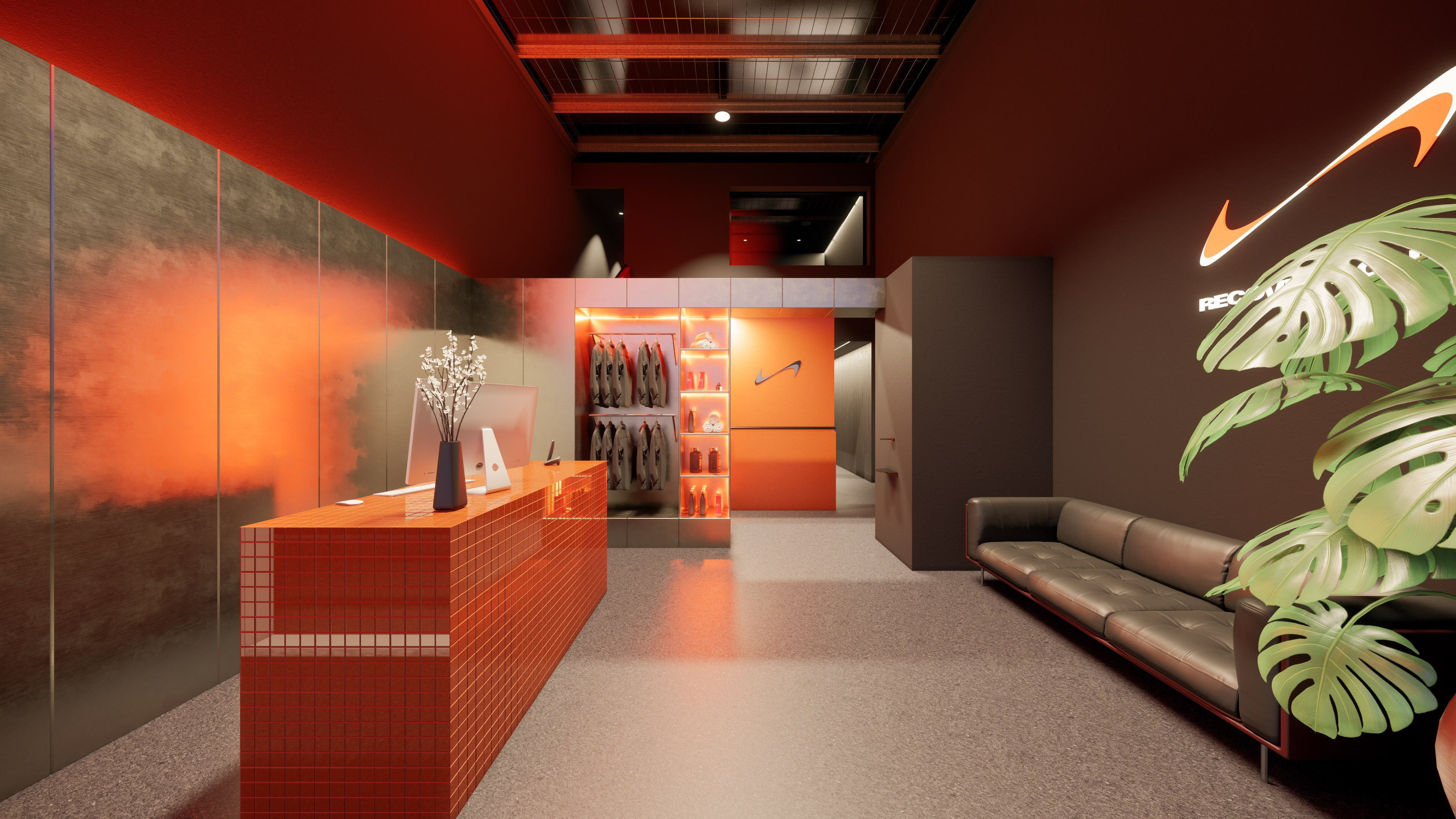
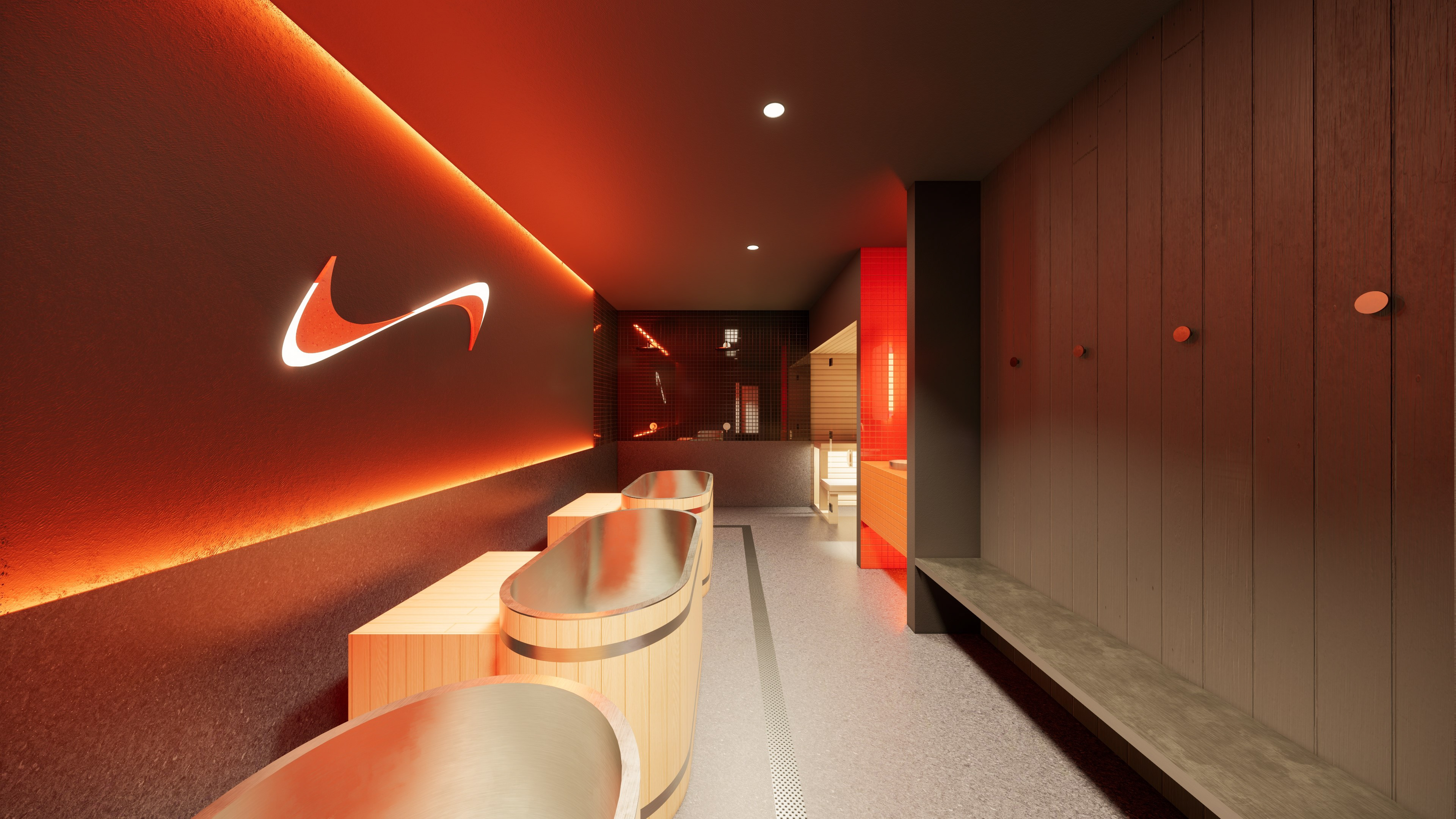
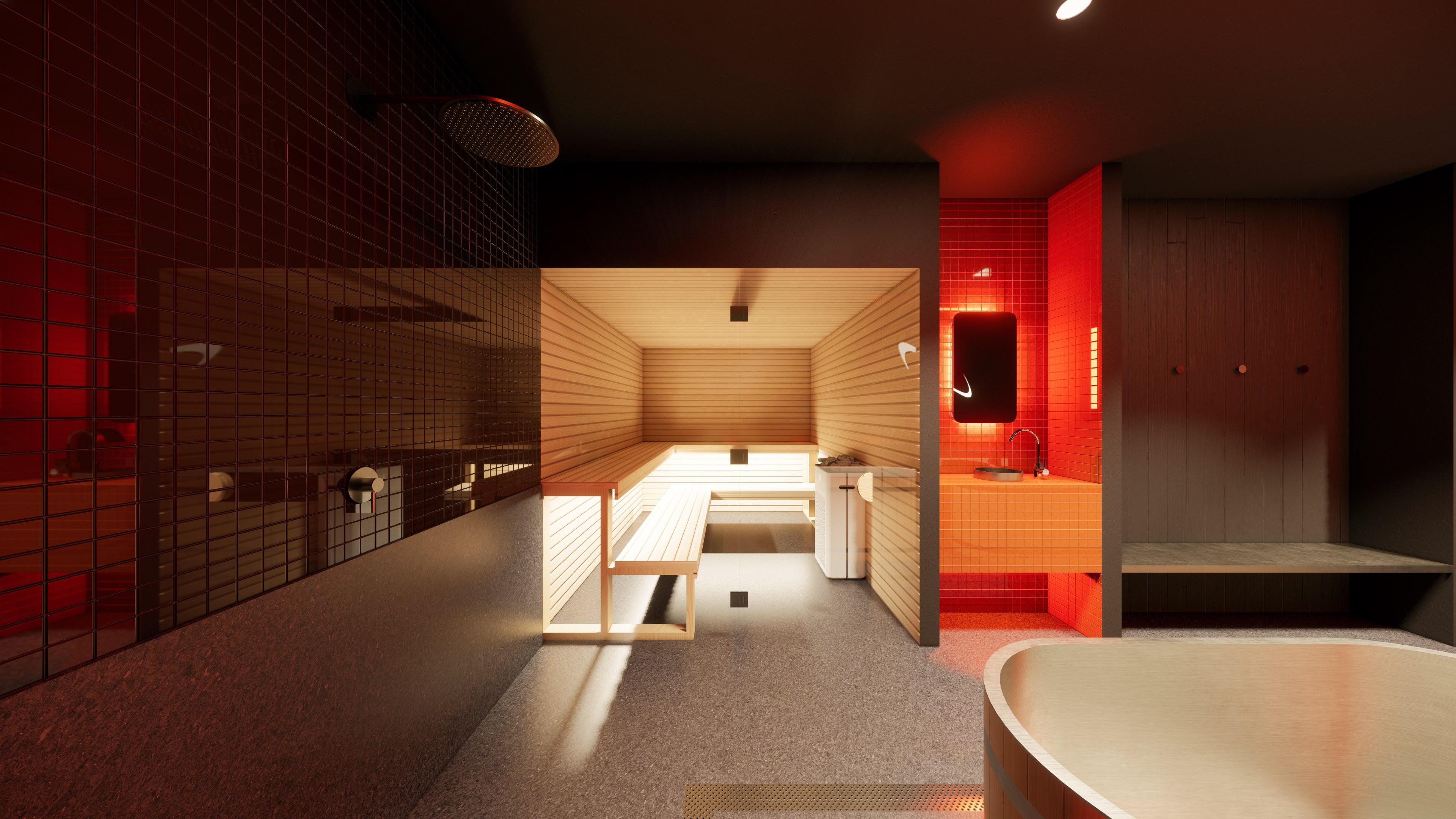
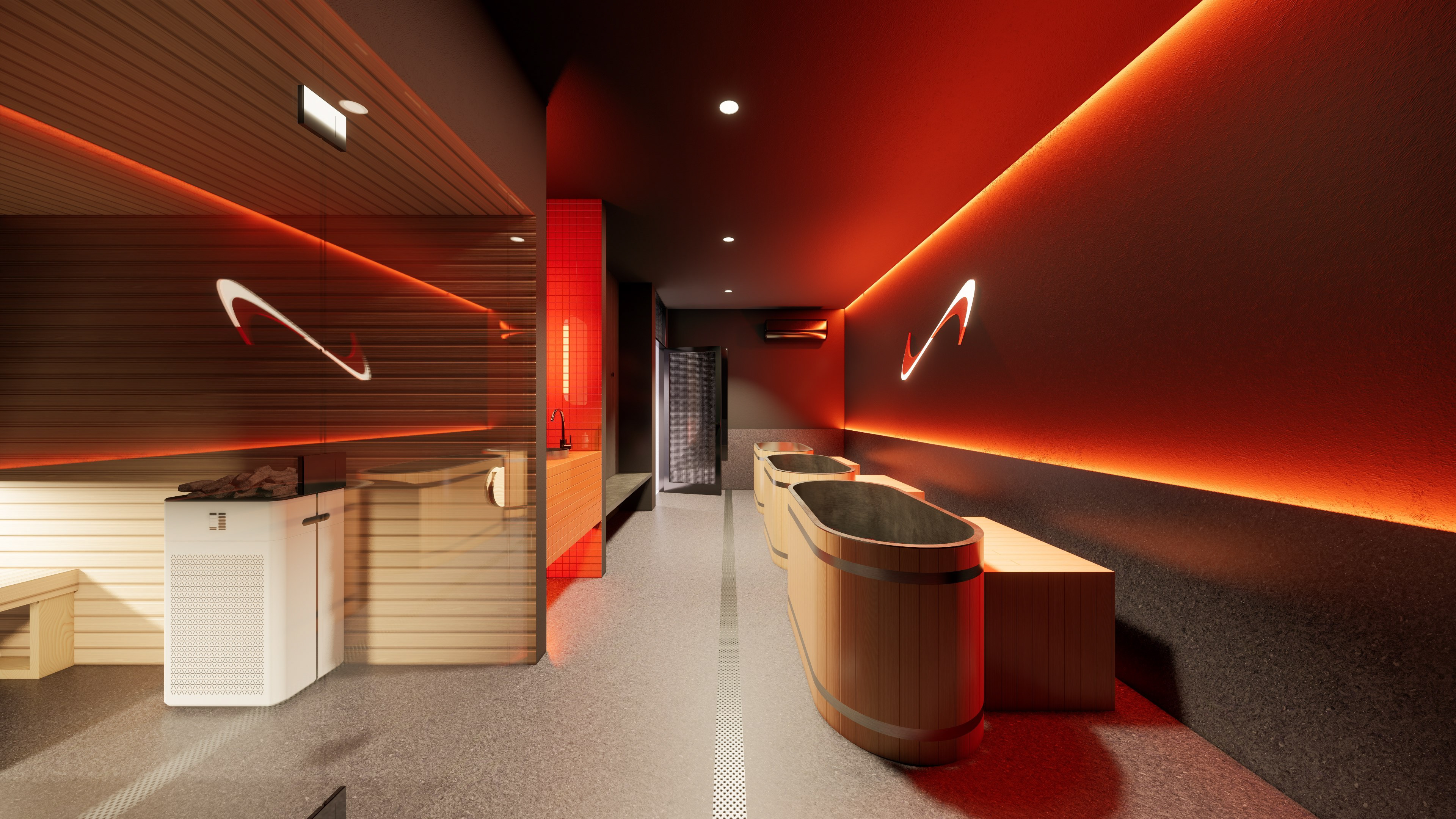
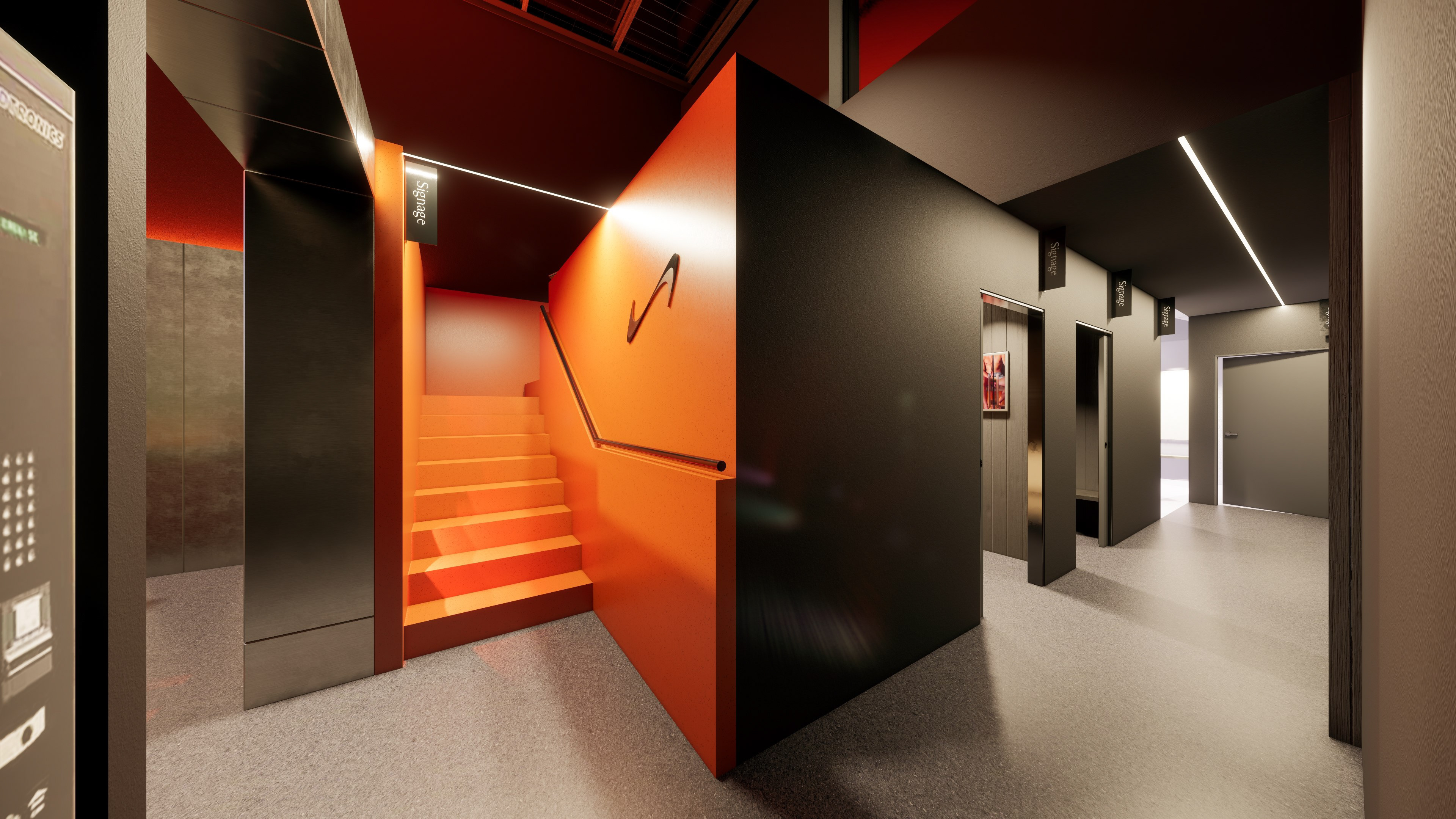
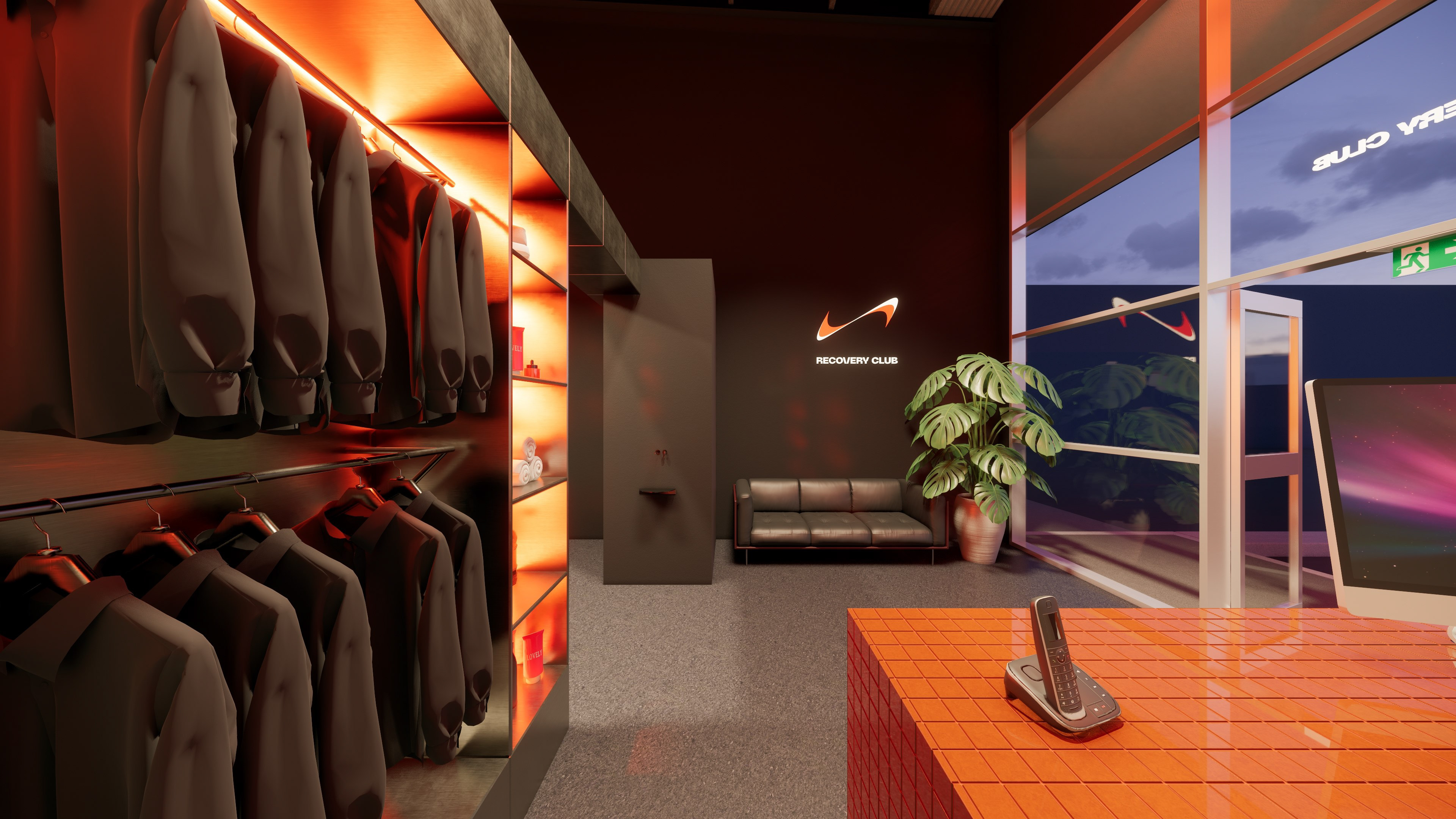
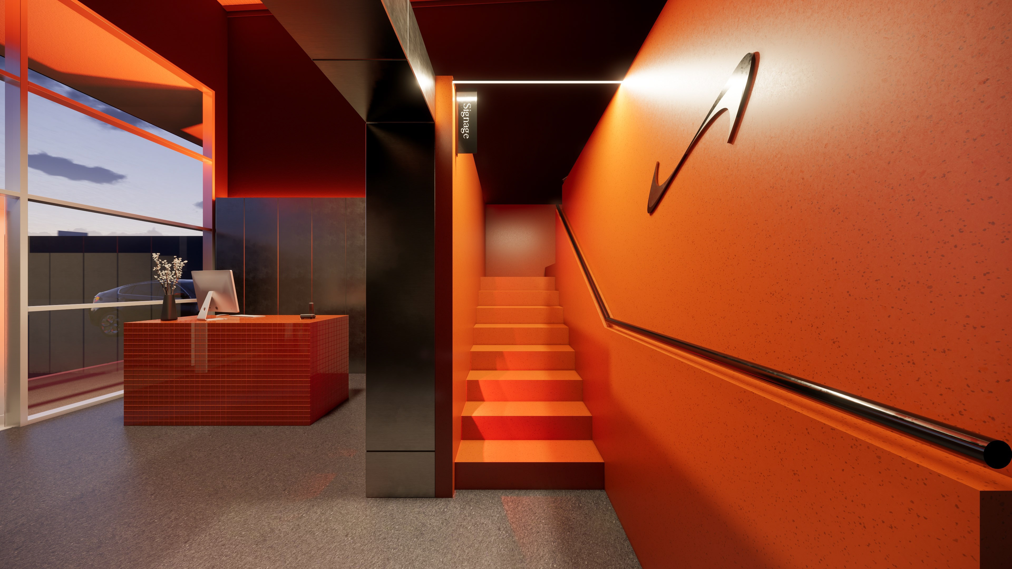
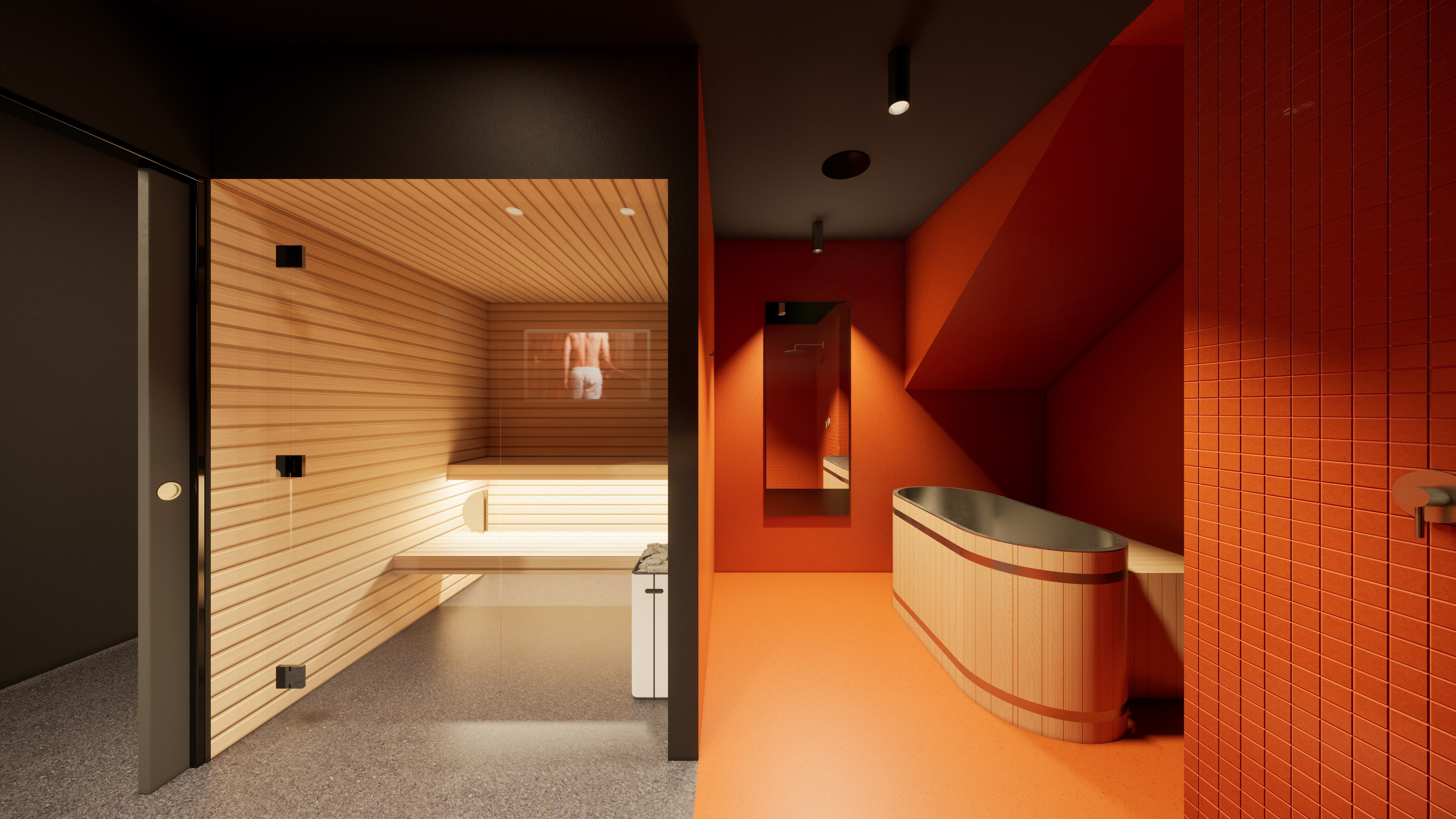
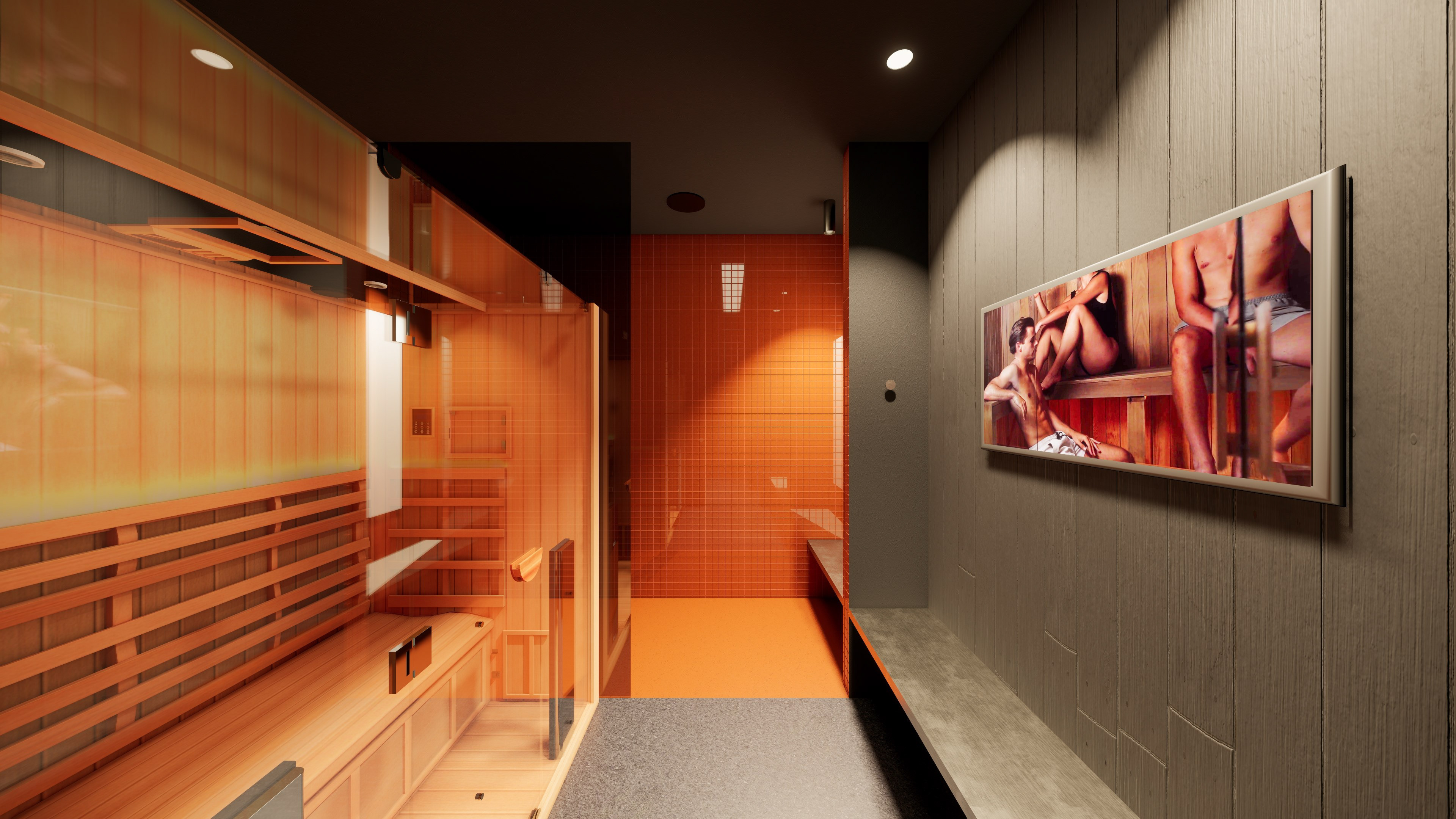
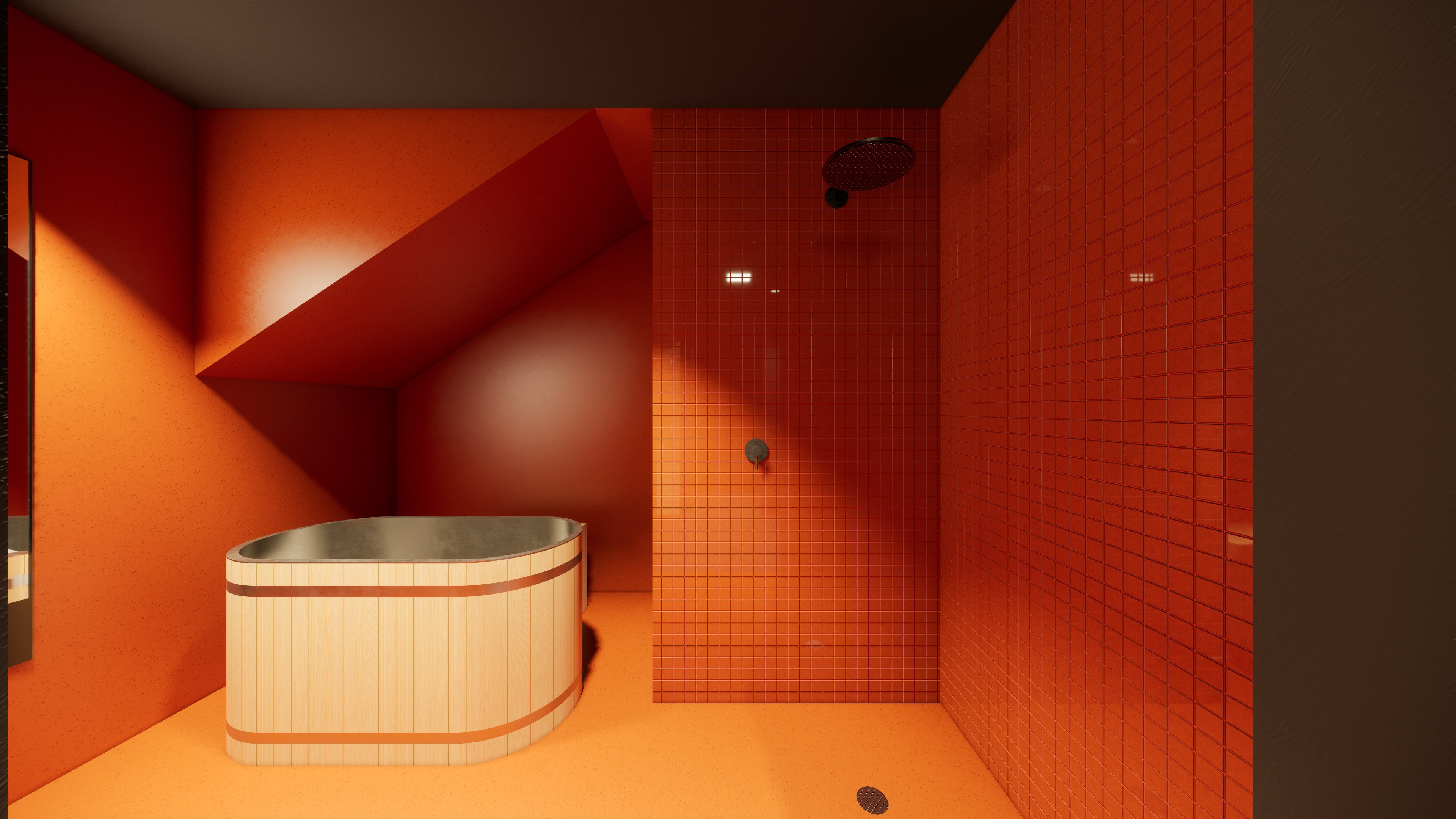
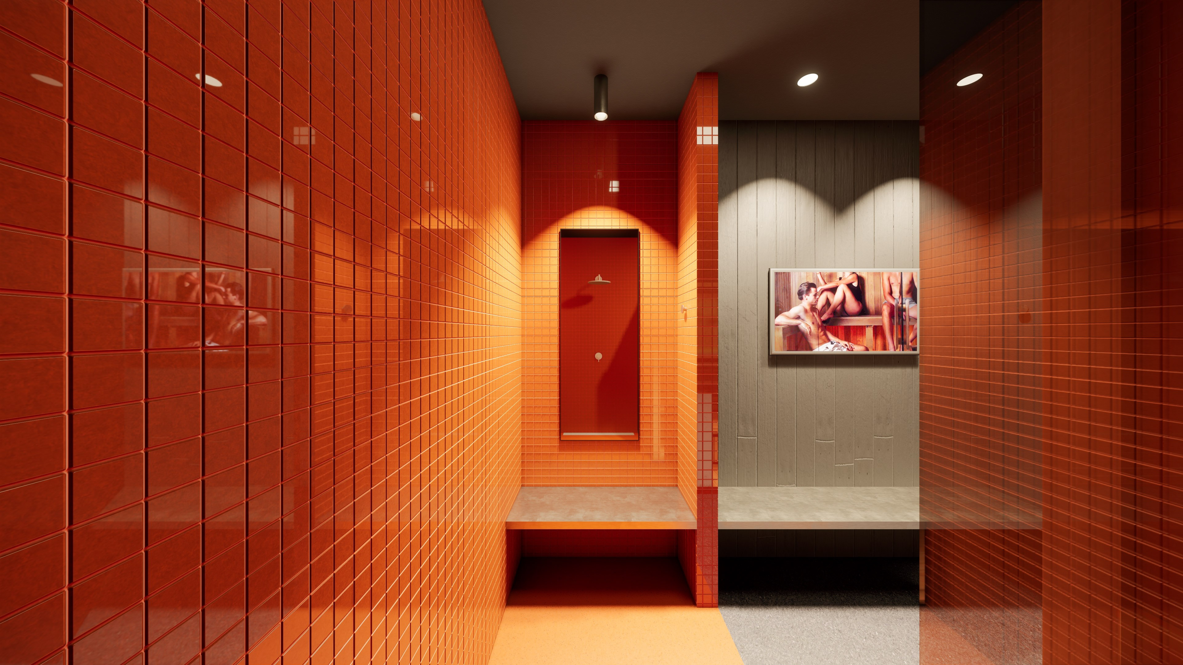
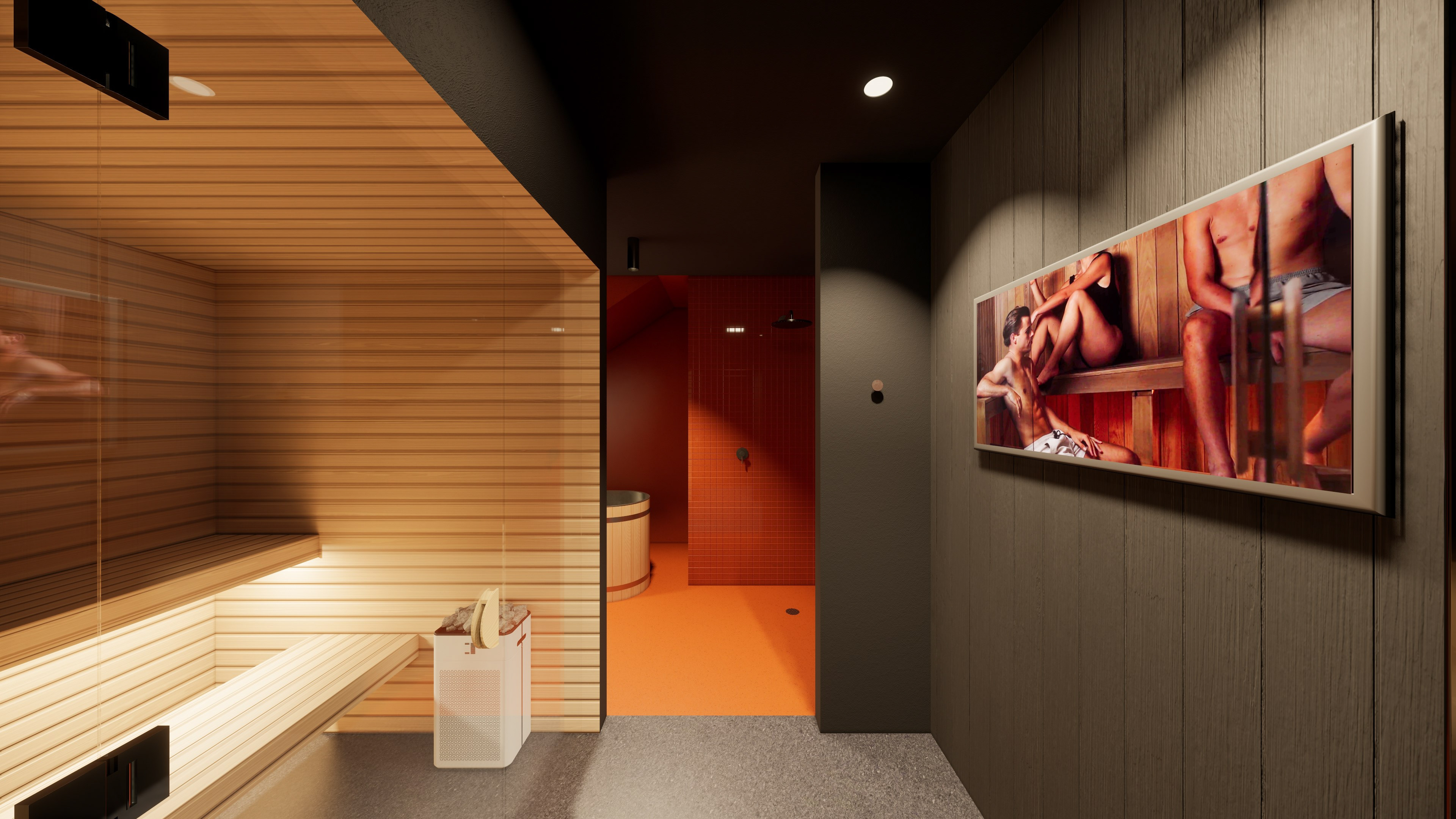
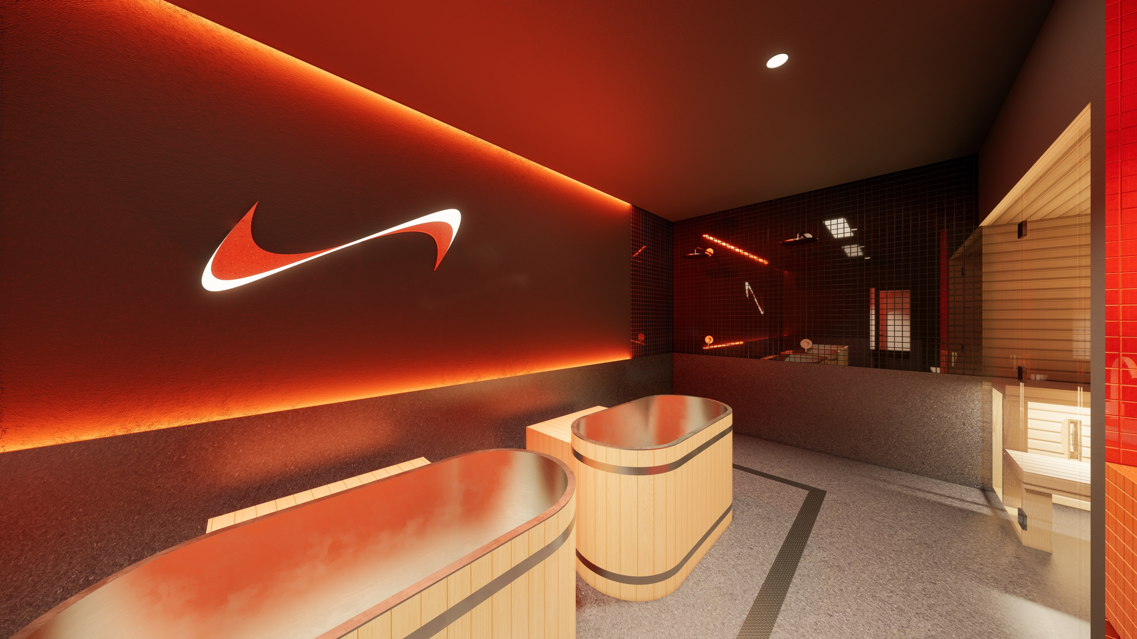
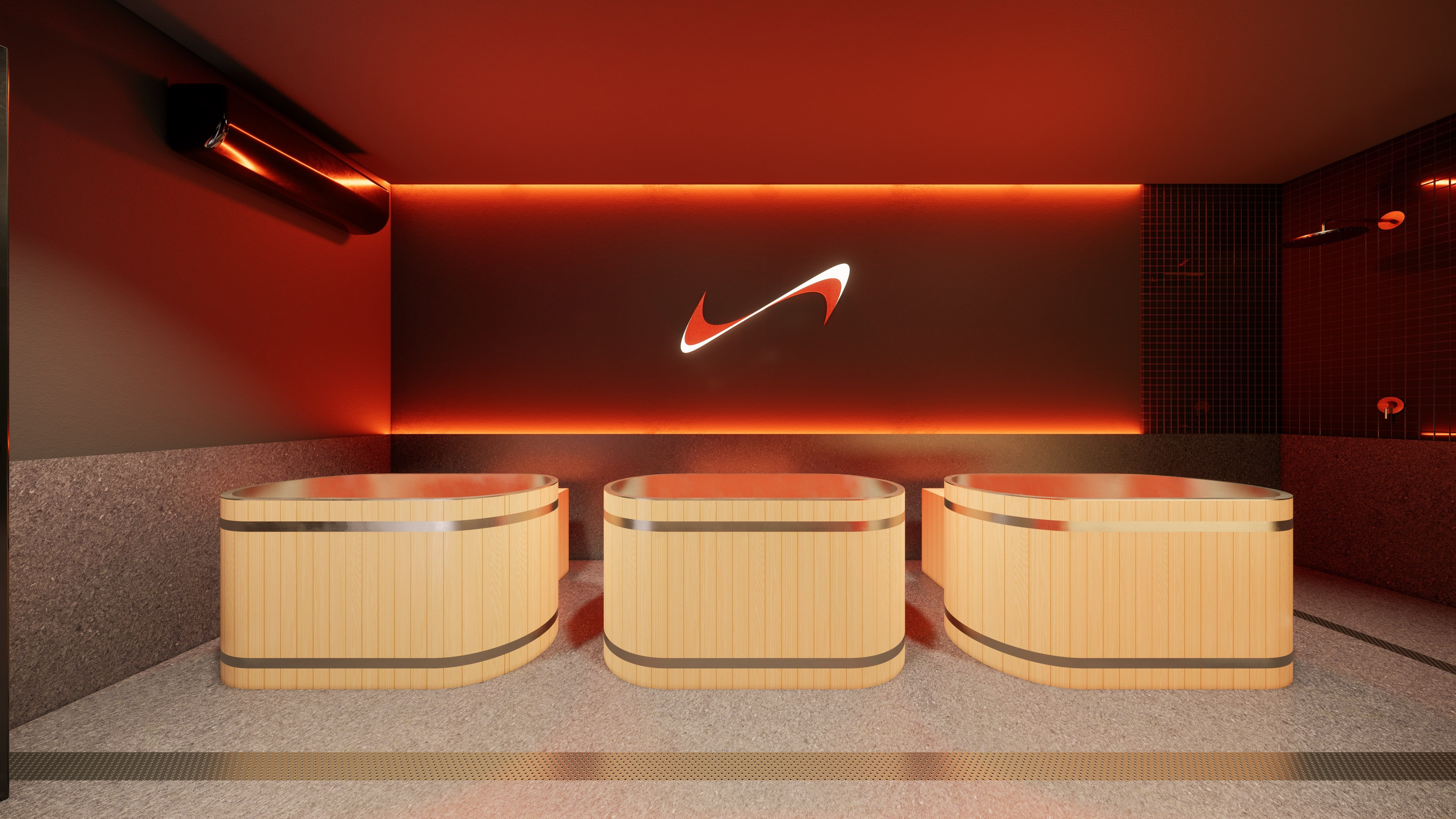
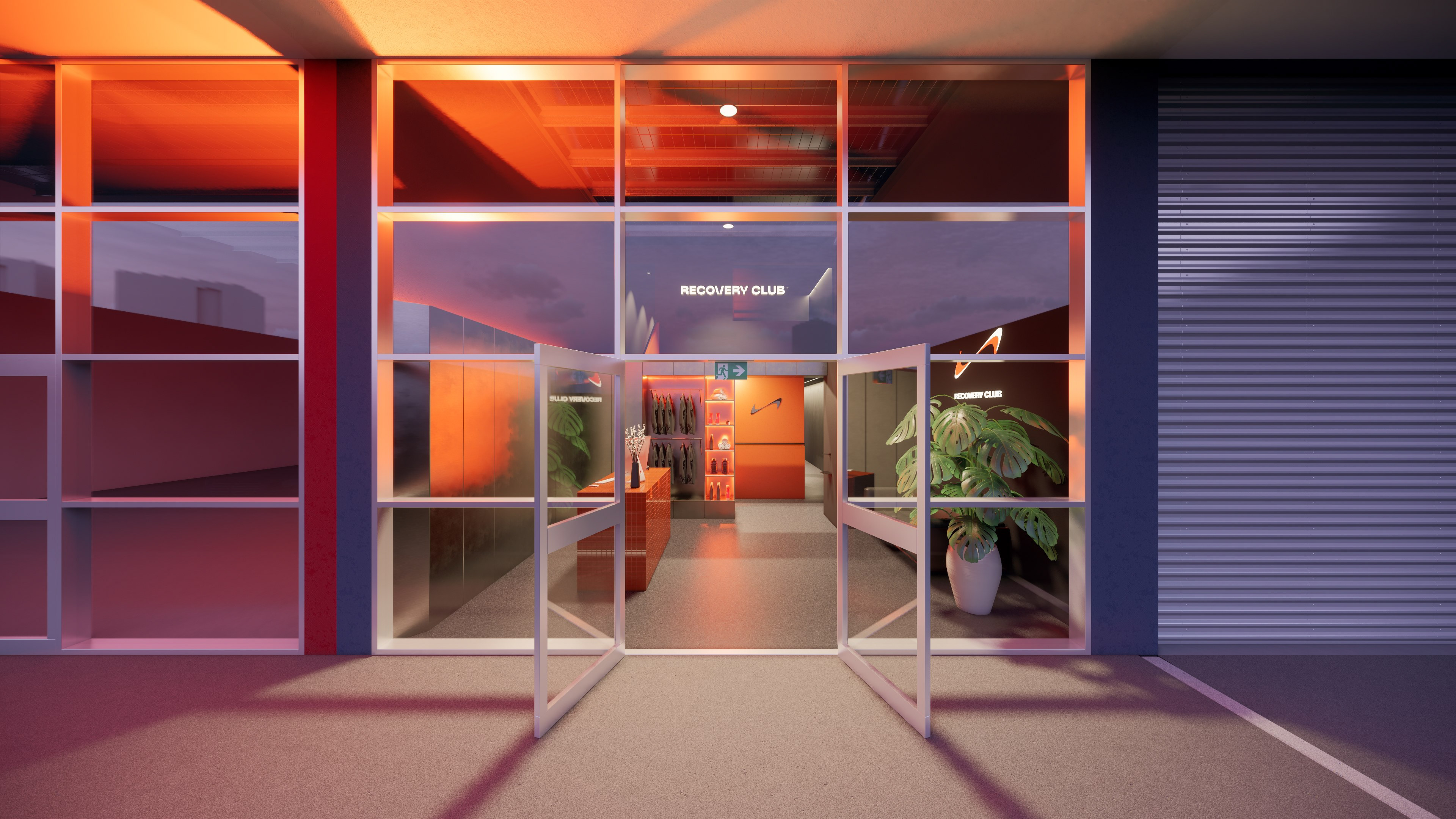
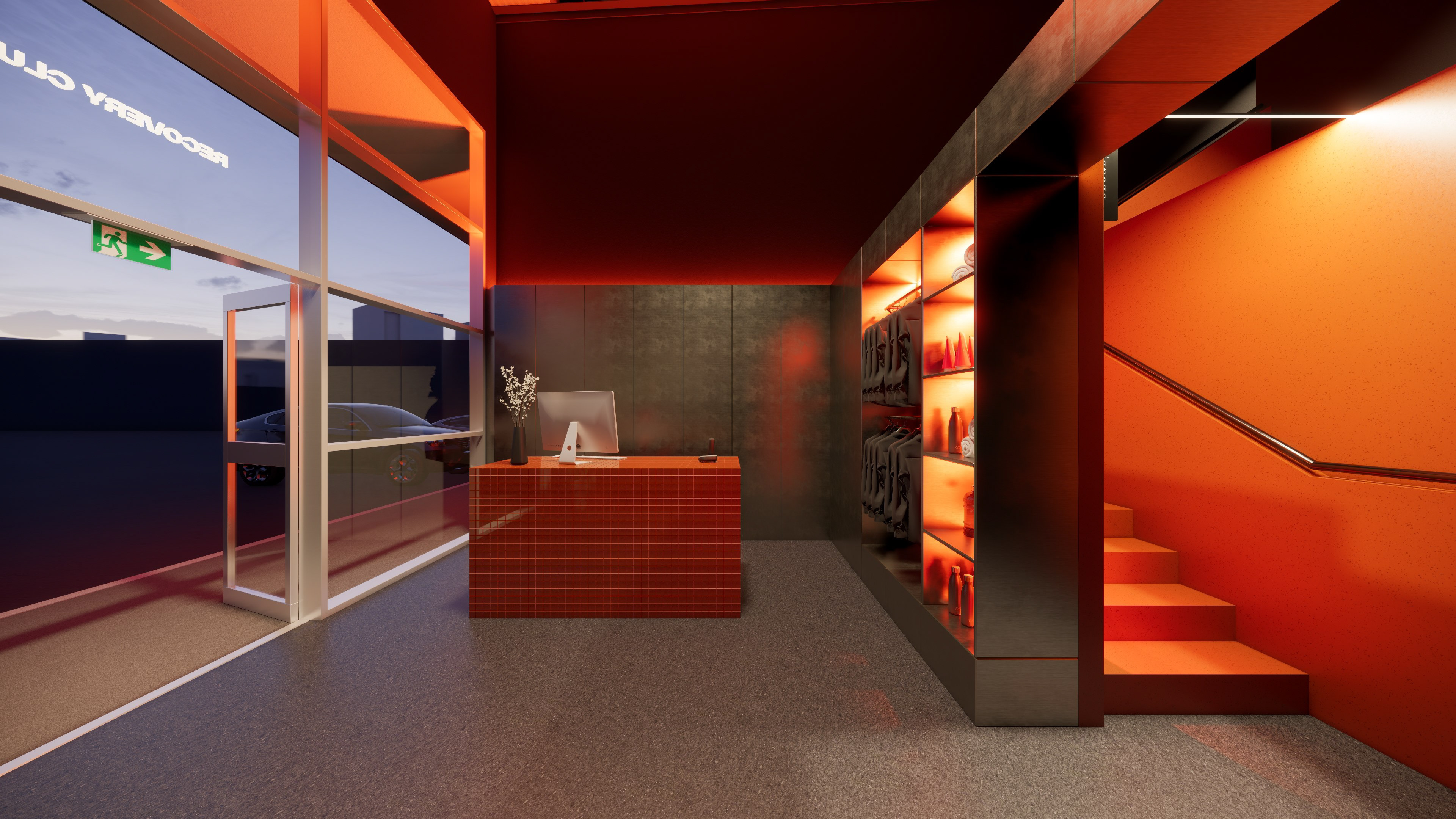
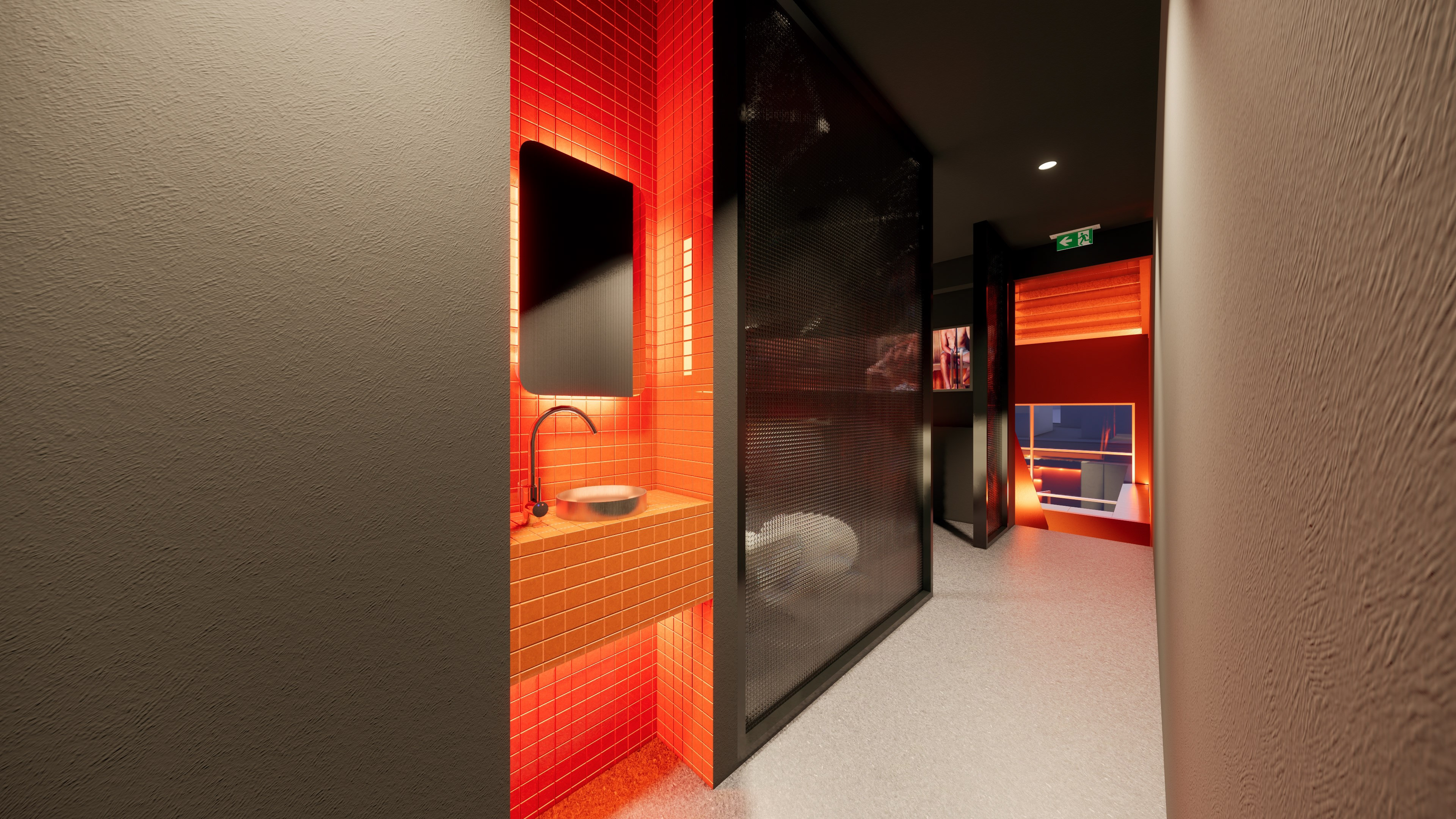
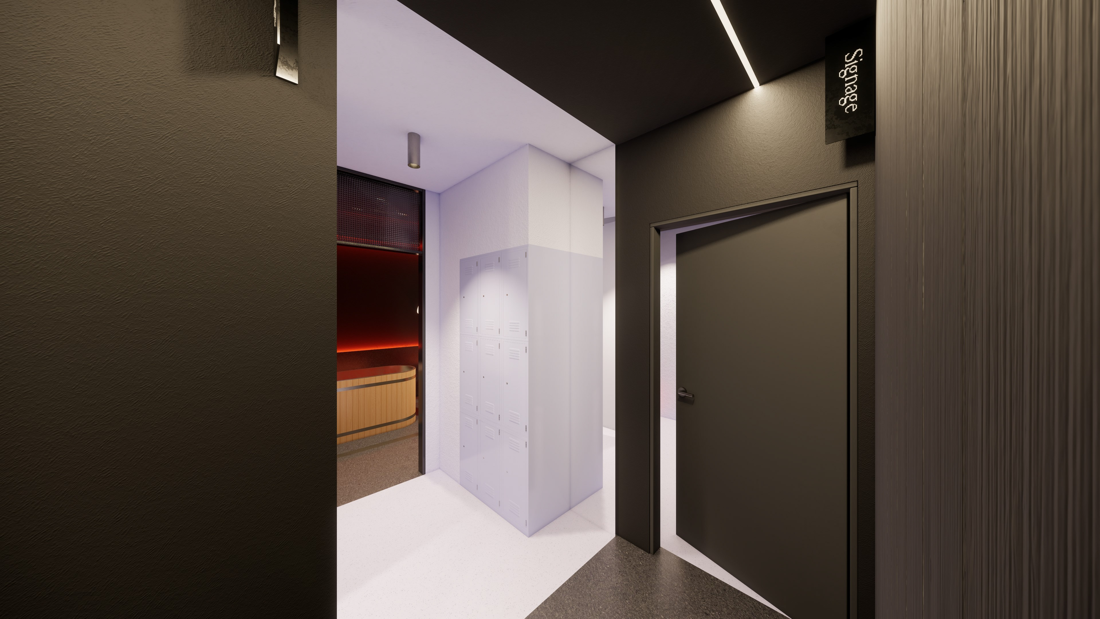
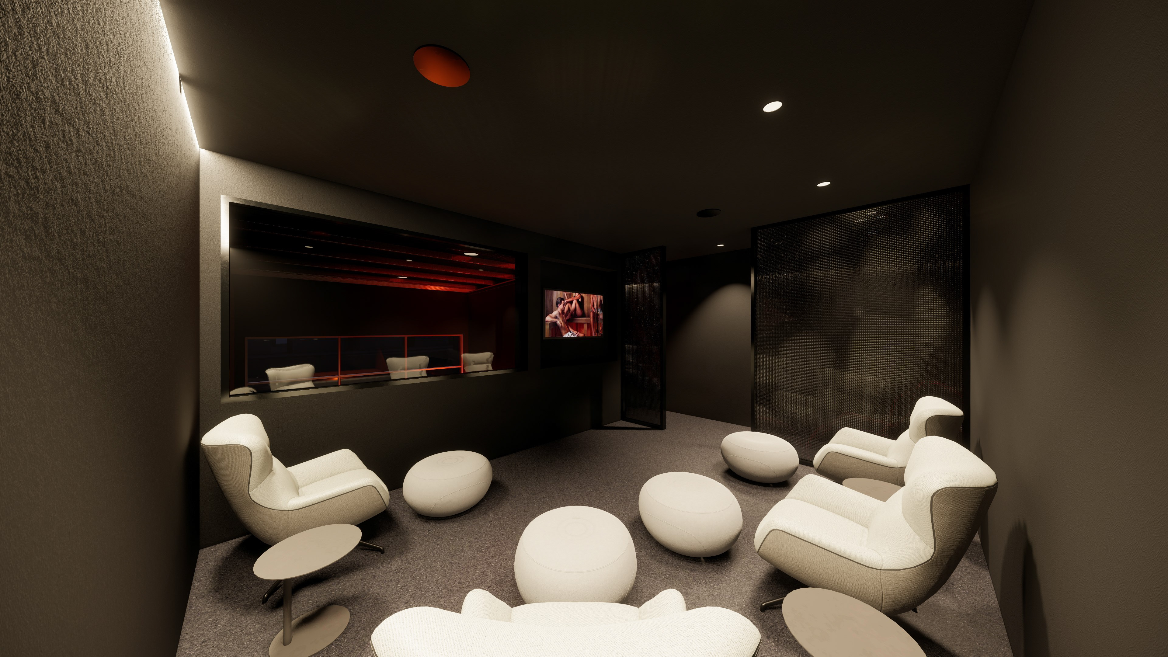
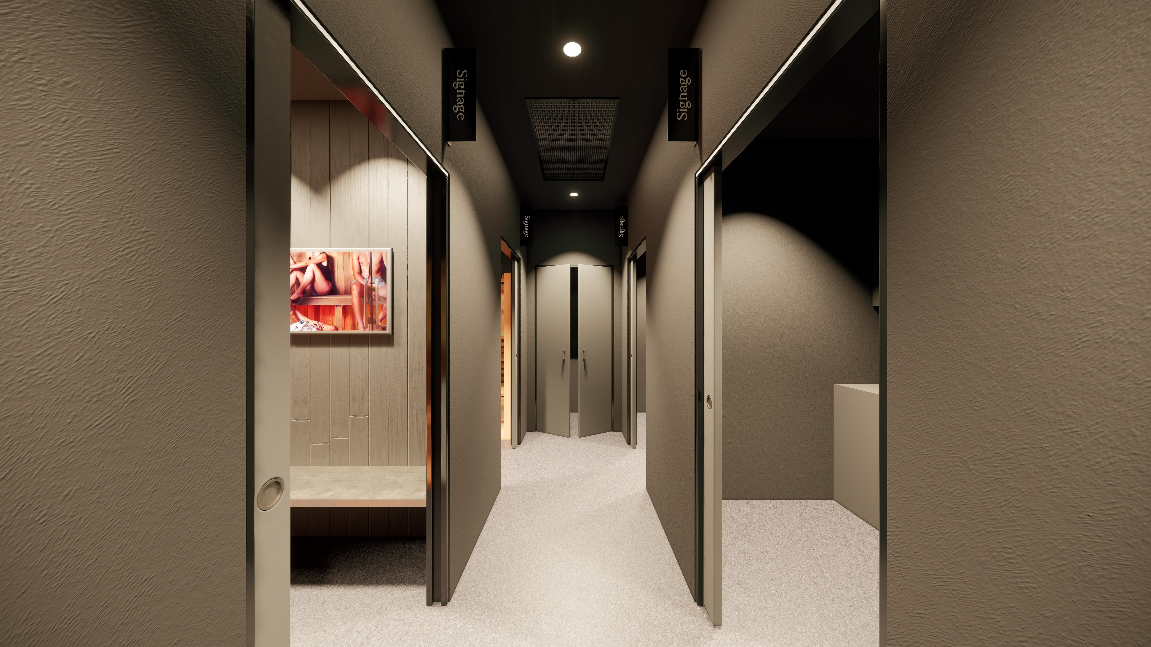
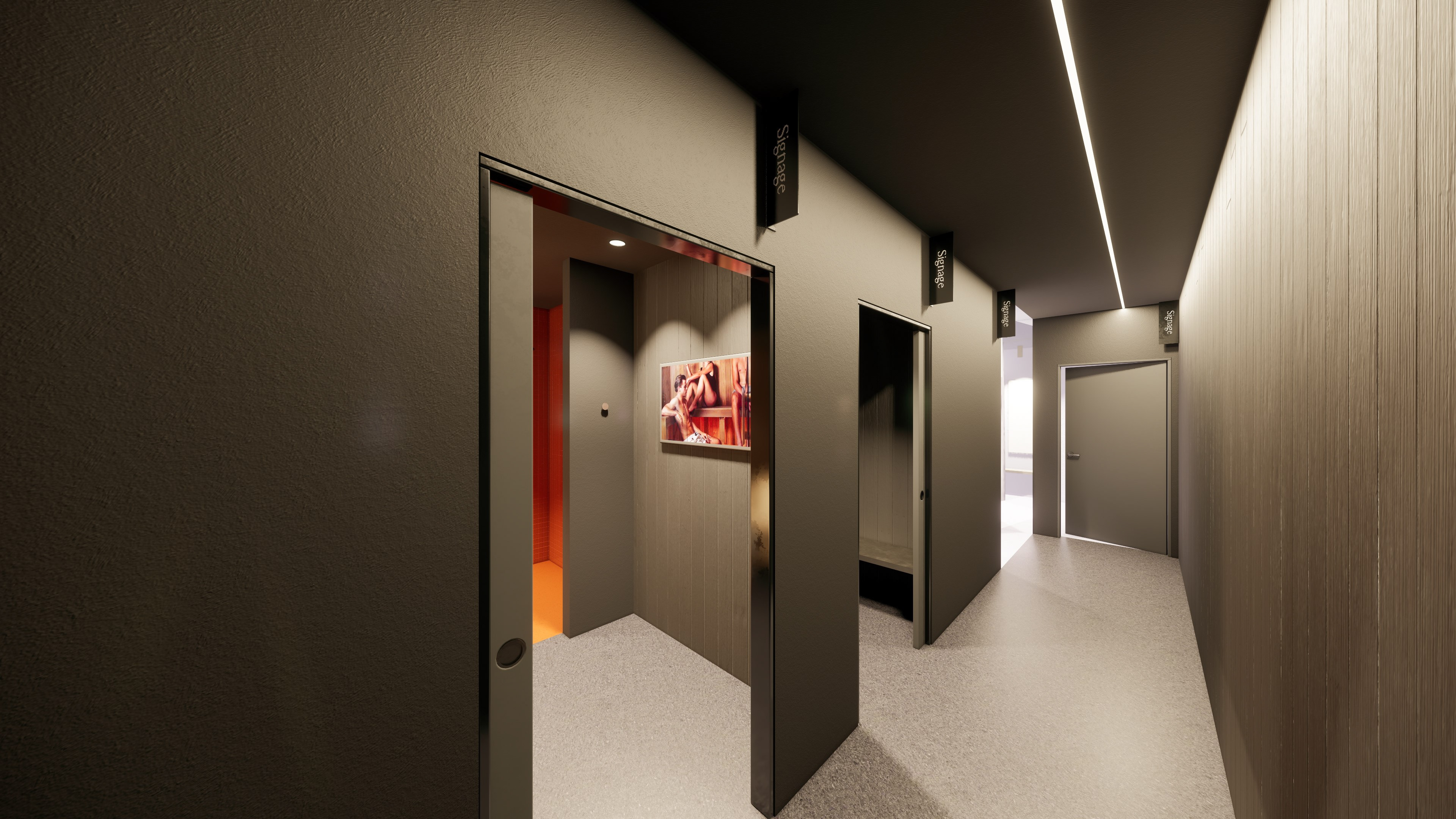

Tasked with the end-to-end brand architecture and interior fitout, the objective for Recovery Club was to move away from the clinical sterile tropes of modern wellness in favour of a moody, athletic sanctuary. Physically, the space is dictated by the brand’s signature ‘Sinopia’ colour, a feature brick red that speaks to infrared heat and provides a high-vis wayfinding tool through the darkened, monolithic interior. In the reception, a grid-tiled, monolithic desk serves as a structured anchor, juxtaposed against the diffuse, atmospheric glow of the corridors. The material palette reinforces the sensory journey of temperature contrast therapy. Handcrafted cedar saunas offer a warm, tactile envelope, while brushed stainless steel and raw concrete evoke the bracing, industrial chill of the ice baths. By treating the brand and the fitout as a singular, cohesive organism, Recovery Club offers a curated environment where the ritual of recovery becomes a shared social event.