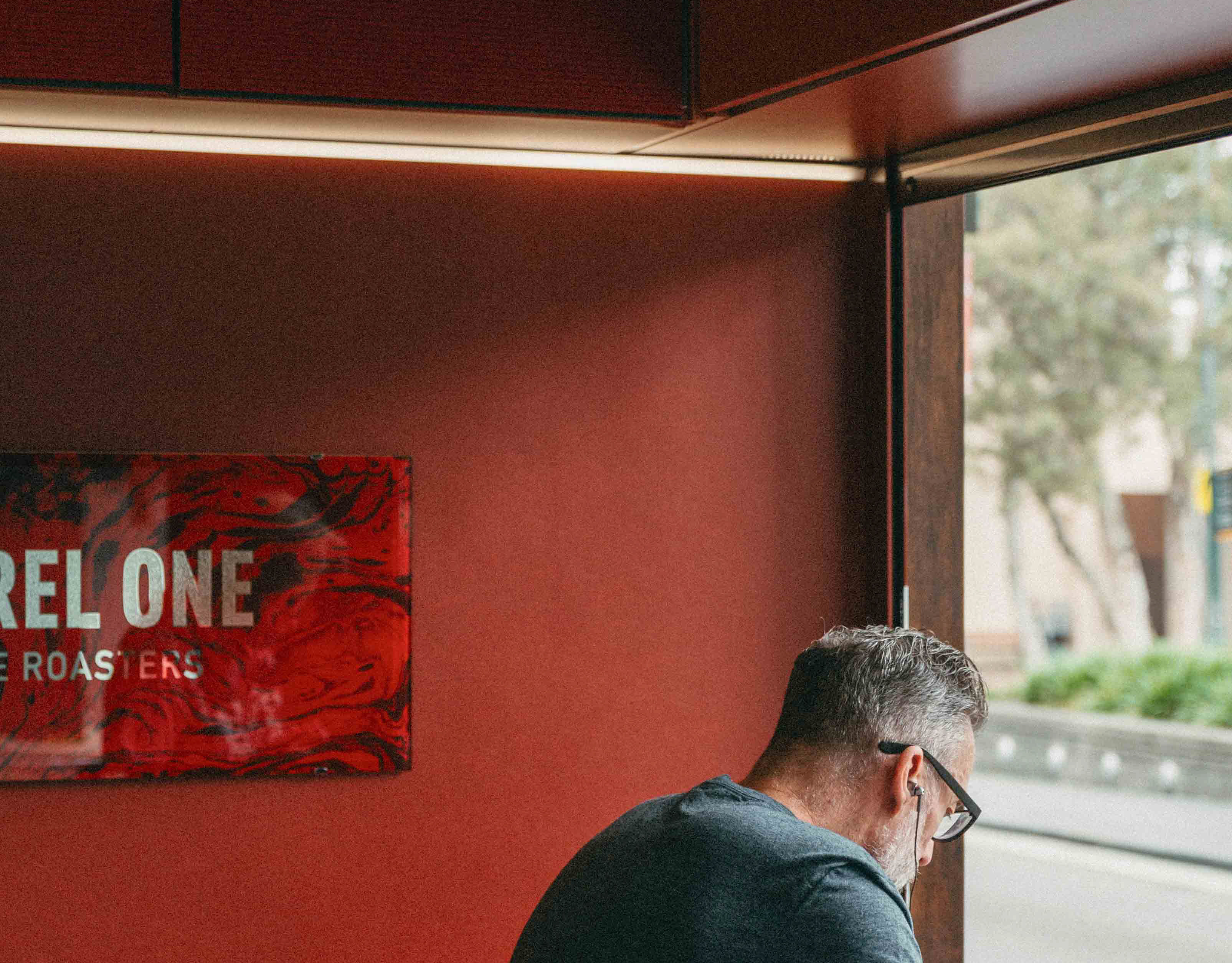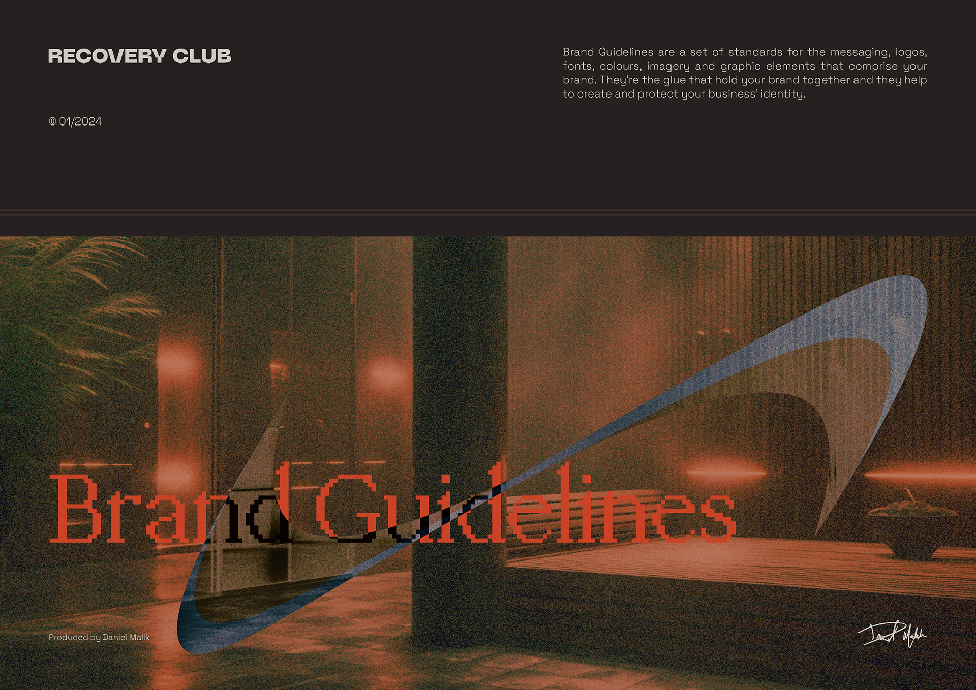
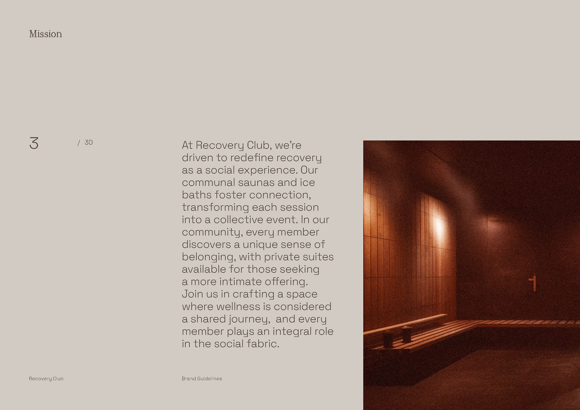
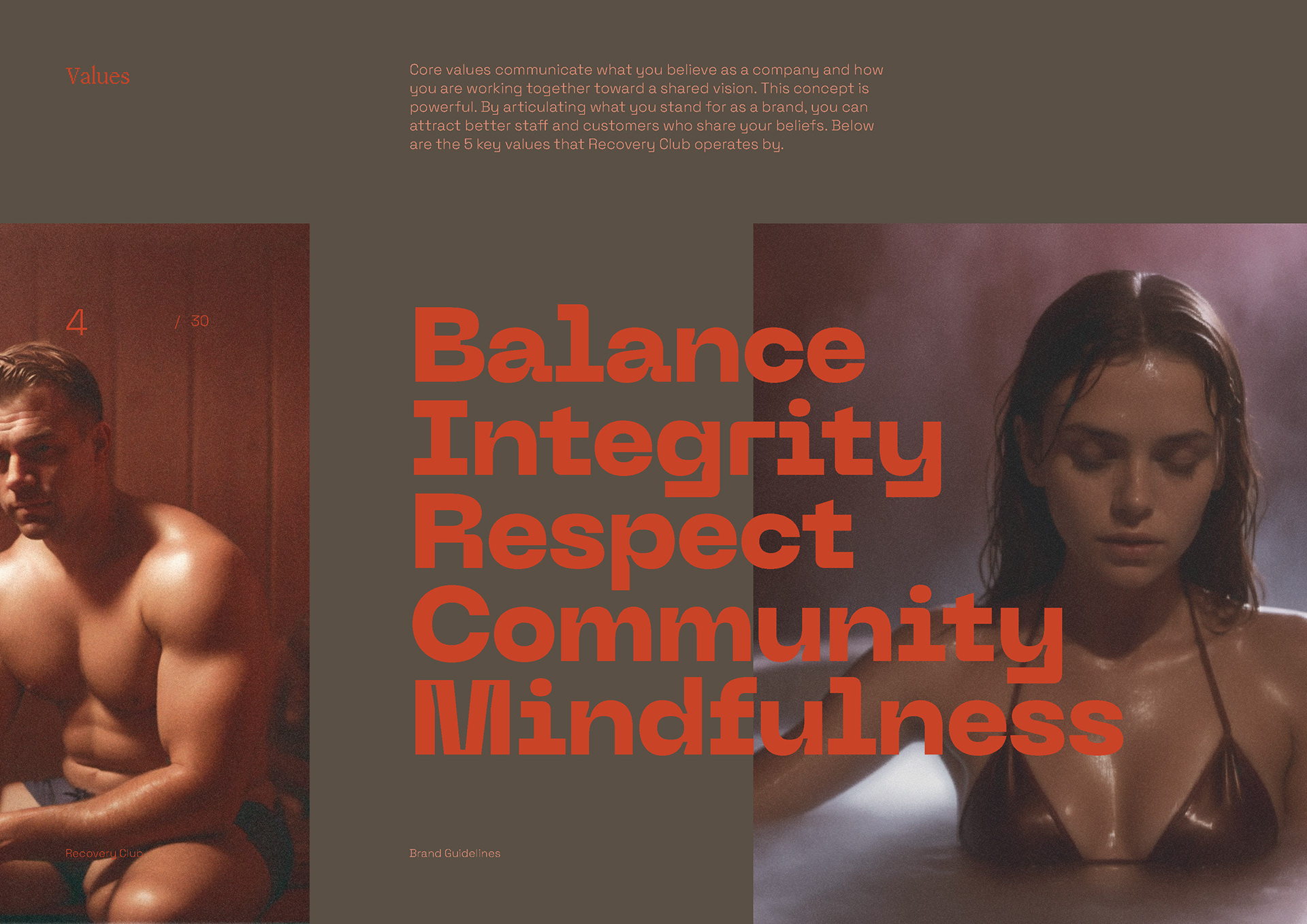
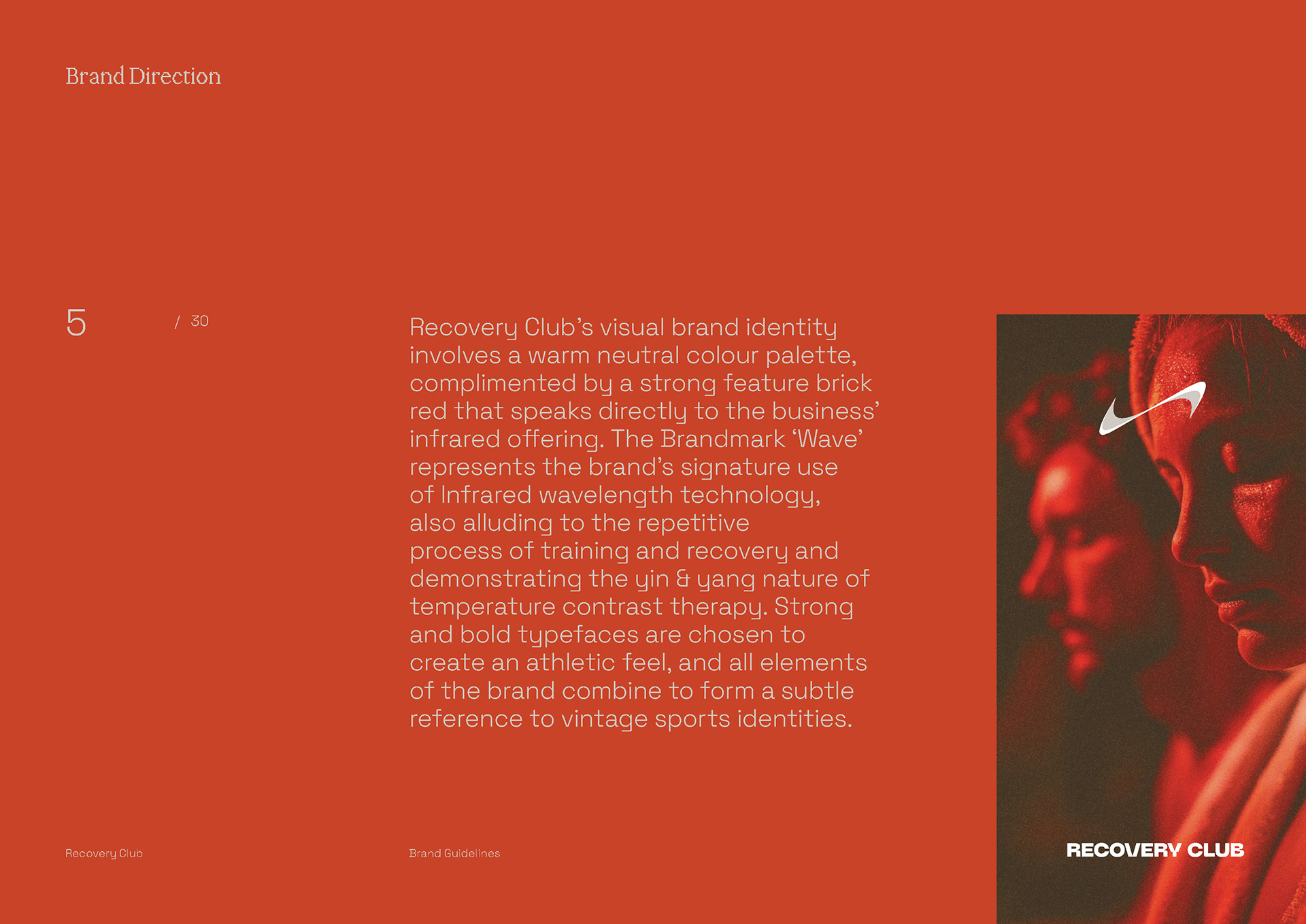
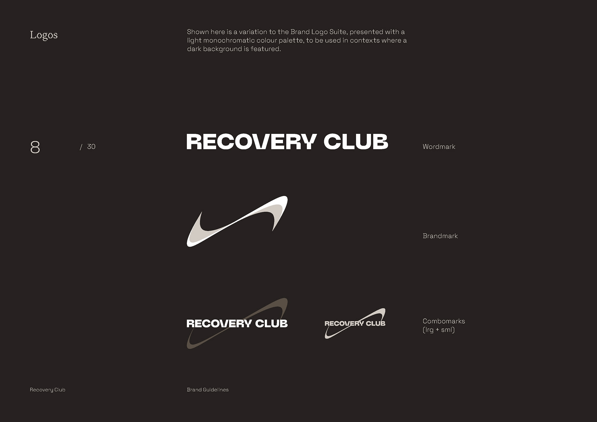
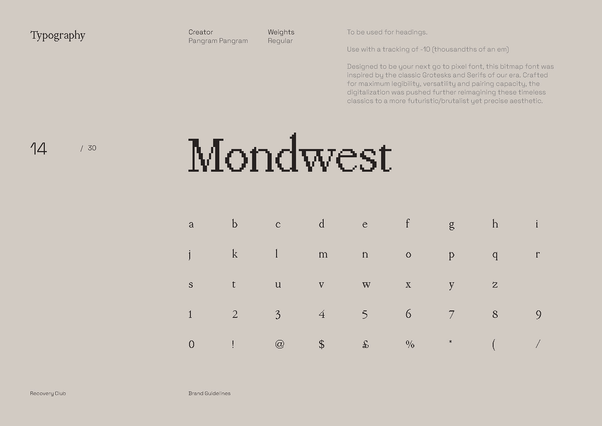
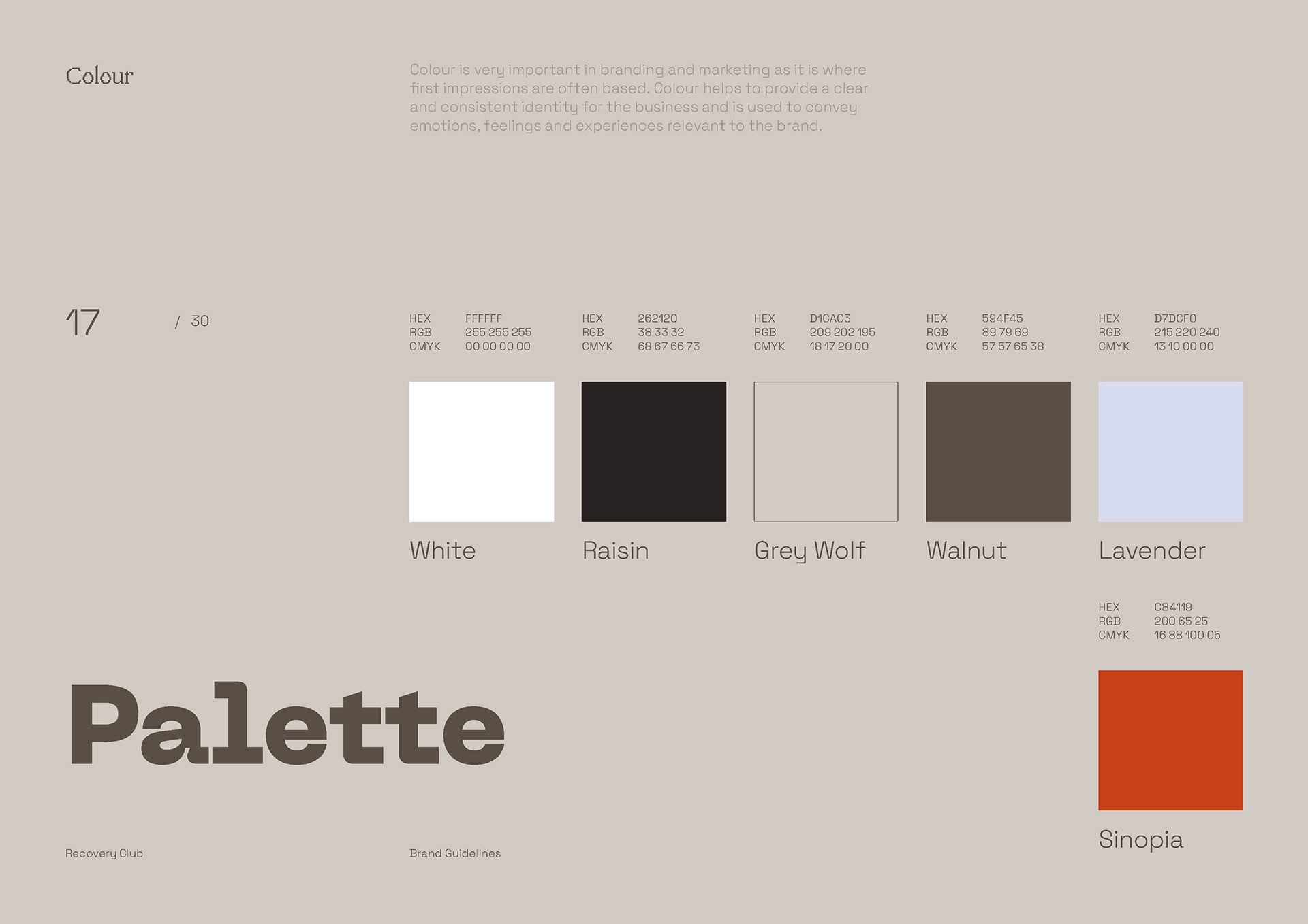
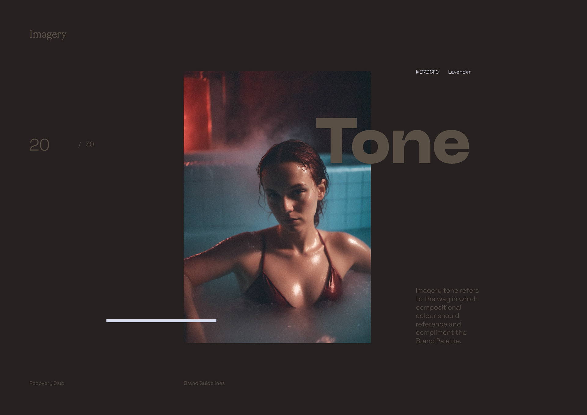
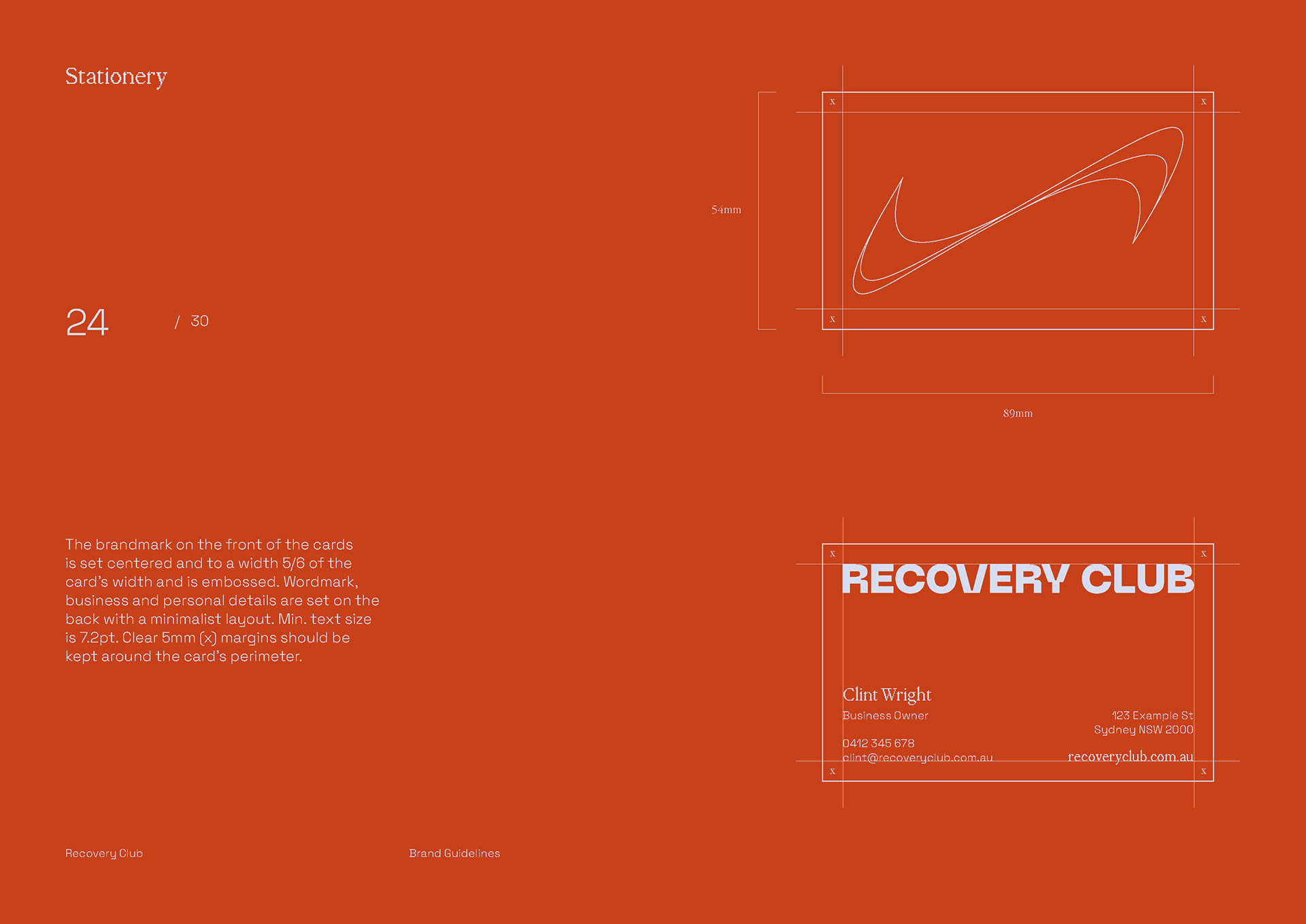
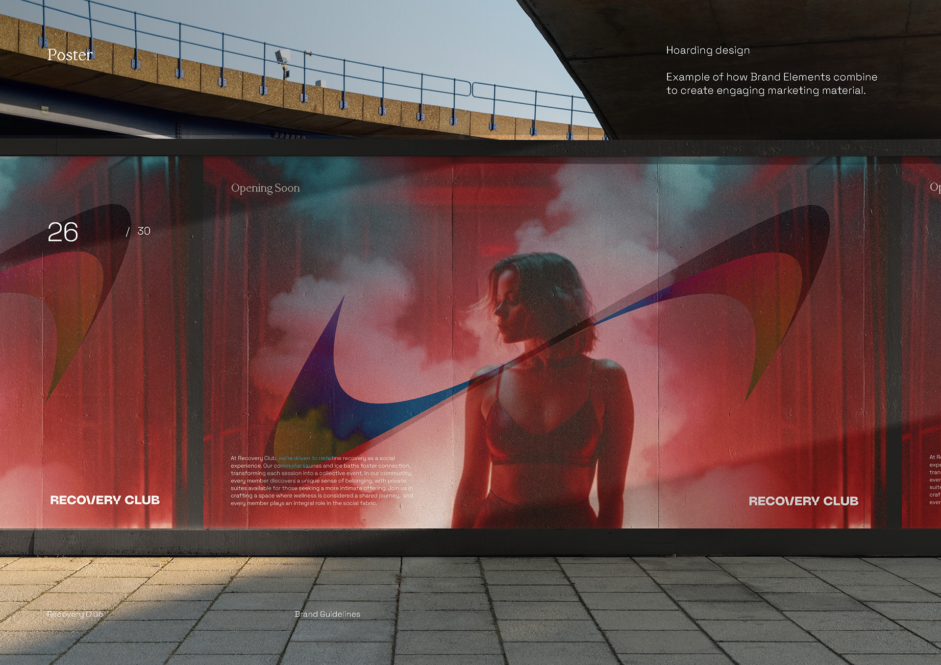
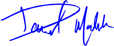
The identity for Recovery Club was designed to subvert the clinical, sterile aesthetic typical of modern wellness, opting instead for a "vintage-athletic" language reimagined through a brutalist lens. The objective was to create a brand that feels as much like a high-performance lab as it does a social sanctuary. The primary brandmark, the ‘Wave’, serves as the conceptual anchor - a fluid representation of infrared wavelength energy and the repetitive cadence of training and restoration. It is a symbol of the yin and yang inherent in contrast therapy; the constant transition between fire and ice. The typographic system utilizes a rigid, machine-inspired hierarchy to reinforce the brand's disciplined nature. Neue Machina provides a robotic, meticulously crafted precision, while the pixelated Mondwest introduces a futuristic, digital texture that references the intersection of science and sport. The palette is centered on ‘Sinopia’, a high-octane brick red that speaks directly to the studio’s infrared offering. It is balanced by a suite of warm, moody neutrals (Raisin, Grey Wolf, and Walnut). Complemented by a photography style defined by heavy film grain and diffuse light, the resulting identity positions recovery not as a solitary chore, but as a shared, social event for the modern athlete.